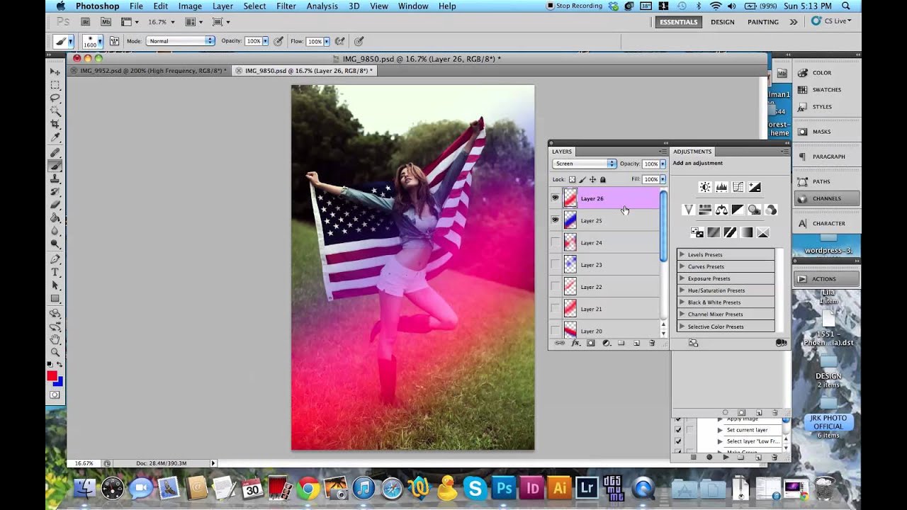
Most of my work lives or dies on what I do after the shoot, not during it. I shoot a lot of outdoor portraits on overcast days in Denver because the light is consistent and I don’t have to fight harsh shadows. The tradeoff is that the images can feel a little flat, a little clinical. No warmth, no magic, nothing that makes someone stop scrolling. For a long time I thought lens flare was something you either captured in camera or you didn’t. Then I watched a Jessica Kobeissi tutorial on adding lens flare and color in Photoshop and realized I’d been making it harder than it needed to be.
Watch the full tutorial on YouTube
What she’s doing is not a cheat. It’s the same logic as dodging and burning, or adding a color grade in Lightroom. You’re steering the viewer’s eye and building a mood that fits the image. The technique is fast, it’s non-destructive when you do it on separate layers, and it scales from subtle to dramatic depending on how heavy-handed you want to be. Here’s exactly how she does it.
Step 1: Set Up a New Layer in Screen Blend Mode
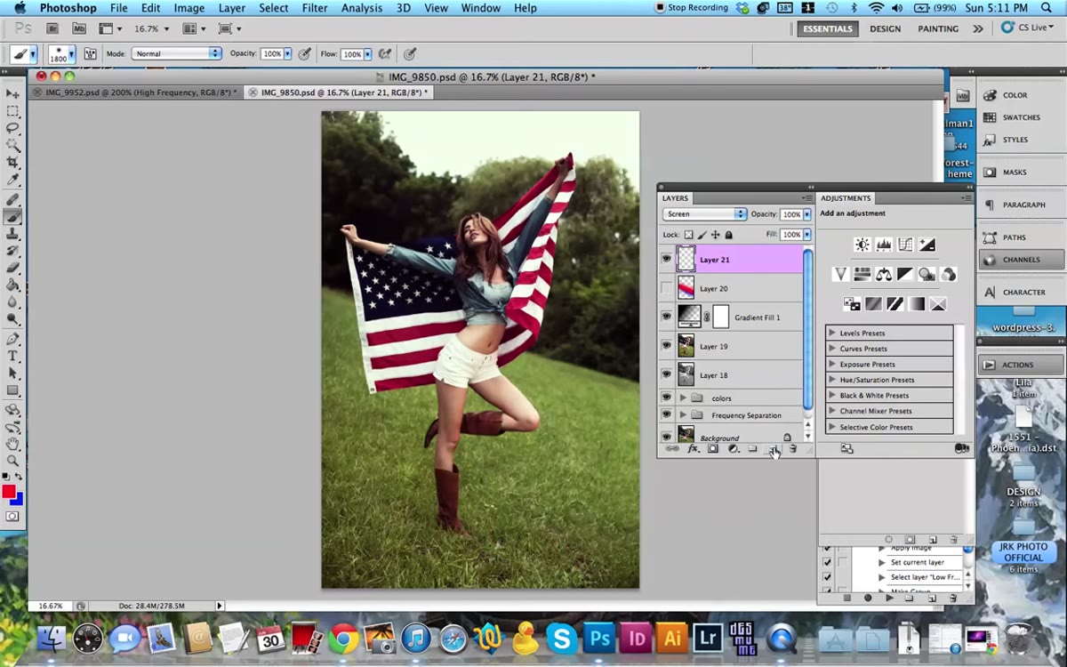 New layer button highlighted, blend mode set to Screen
Before you paint anything, you need the right foundation. Create a new layer above your base image by clicking the new layer icon in the Layers panel or pressing Command + Shift + N on Mac. Then immediately change that layer’s blend mode from Normal to Screen. Screen mode means any dark values you paint become invisible and only the light, bright tones show through. This is what keeps your painted flare from looking like someone just smeared color on top of a photo.
New layer button highlighted, blend mode set to Screen
Before you paint anything, you need the right foundation. Create a new layer above your base image by clicking the new layer icon in the Layers panel or pressing Command + Shift + N on Mac. Then immediately change that layer’s blend mode from Normal to Screen. Screen mode means any dark values you paint become invisible and only the light, bright tones show through. This is what keeps your painted flare from looking like someone just smeared color on top of a photo.
Don’t skip the blend mode step and plan to change it later. It changes how you see your brush strokes as you work, and you need that visual feedback in real time.
Step 2: Choose a Soft Round Brush at Maximum Size
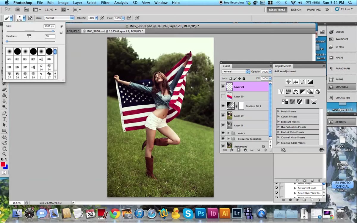 Brush settings panel showing hardness at zero, large brush size
Go to your brush tool and pull up the brush settings. Set the hardness to zero. This is non-negotiable. A hard-edged brush will give you a circle with visible edges, which looks nothing like a light source. You want a brush that fades completely from center to edge. Then size it up, bigger than you think you need. Jessica goes huge here, large enough that a single click covers a significant chunk of the frame.
Brush settings panel showing hardness at zero, large brush size
Go to your brush tool and pull up the brush settings. Set the hardness to zero. This is non-negotiable. A hard-edged brush will give you a circle with visible edges, which looks nothing like a light source. You want a brush that fades completely from center to edge. Then size it up, bigger than you think you need. Jessica goes huge here, large enough that a single click covers a significant chunk of the frame.
The size matters because real lens flare and light leaks bleed across large areas. A small soft brush just makes a glowing dot. A massive soft brush starts to feel like actual scattered light.
Step 3: Pick a Bright, Saturated Color
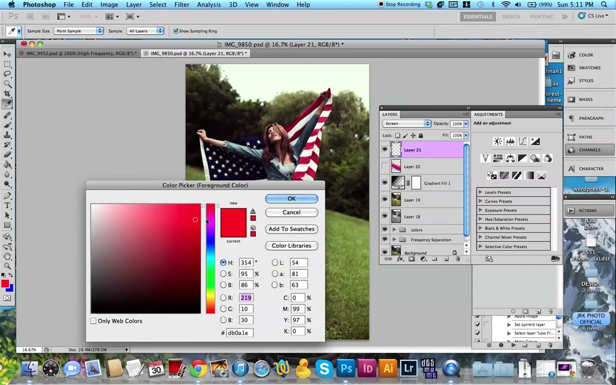 Color picker open with a vivid red selected
Open the color picker and go warm. Jessica gravitates toward reds and oranges first because they read as sunlight. The key word she uses is bright. Muted colors on a Screen layer go nearly invisible, which defeats the purpose. You want something vivid enough that it registers even at reduced opacity.
Color picker open with a vivid red selected
Open the color picker and go warm. Jessica gravitates toward reds and oranges first because they read as sunlight. The key word she uses is bright. Muted colors on a Screen layer go nearly invisible, which defeats the purpose. You want something vivid enough that it registers even at reduced opacity.
She’s also honest that this is a taste call. You can go too far. The goal is color that feels like it belongs to the light in the scene, not color that announces itself as a Photoshop layer. Start with something in the warm range and you can always cool it down or pull it back with opacity later.
Step 4: Paint the Flare Across the Frame
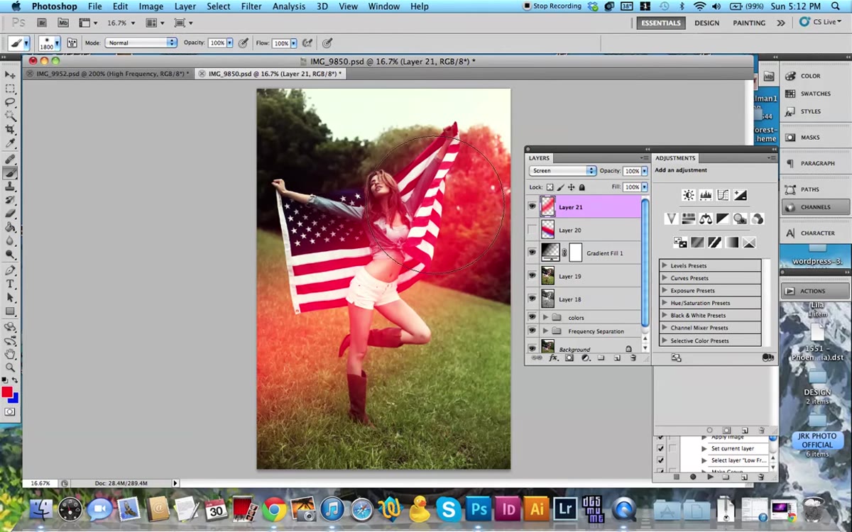 Single brush stroke painted across image in Screen mode
With your Screen layer active and your oversized soft brush loaded with color, click or drag across the area where you want the flare to originate. One swipe across the upper corner of an image is often enough to create something that looks intentional and interesting. Jessica demonstrates this with a single horizontal drag and the effect is immediate. The color blends into the highlights of the photo and fades naturally into the shadows.
Single brush stroke painted across image in Screen mode
With your Screen layer active and your oversized soft brush loaded with color, click or drag across the area where you want the flare to originate. One swipe across the upper corner of an image is often enough to create something that looks intentional and interesting. Jessica demonstrates this with a single horizontal drag and the effect is immediate. The color blends into the highlights of the photo and fades naturally into the shadows.
The placement logic is the same as real flare: it comes from a light source, usually at the edge of the frame or just outside it. Position your stroke near a corner or along the top edge to keep it believable.
Step 5: Layer Multiple Colors on Separate Layers
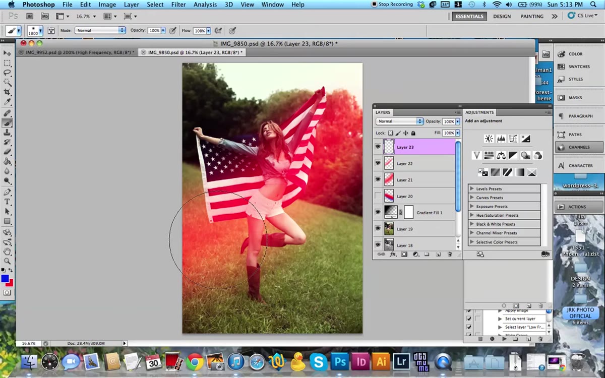 Second new layer added with blue color being painted on edges
One color layer looks fine. Two or three color layers look like a photograph taken into a setting sun. Create a second new layer, set it to Screen again, and switch to a contrasting color. Jessica goes to blue after her red layer. She paints touches of blue along the opposite edge of the frame.
Second new layer added with blue color being painted on edges
One color layer looks fine. Two or three color layers look like a photograph taken into a setting sun. Create a second new layer, set it to Screen again, and switch to a contrasting color. Jessica goes to blue after her red layer. She paints touches of blue along the opposite edge of the frame.
The reason this works is that real lens flare is spectral. Light diffracts through glass and splits into multiple colors across the frame. When you stack a warm tone in one corner and a cool tone in another, your brain reads it as optical physics happening, not someone painting in Photoshop. Keep each color on its own layer so you can dial each one up or down independently.
Step 6: Erase Selectively to Clean It Up
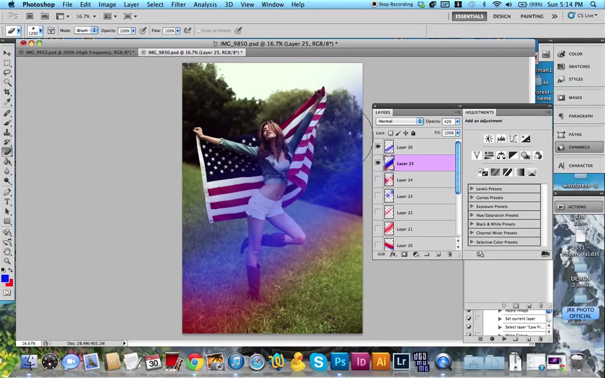 Eraser tool removing flare from subject’s face area
Once you have your color layers down, switch to the eraser and go back to that same soft round brush. Reduce the opacity of the eraser to somewhere around 30 to 50 percent. Then gently pull the flare off the parts of the image where it shouldn’t dominate, usually the subject’s face and the mid-ground areas that need to stay sharp and readable.
Eraser tool removing flare from subject’s face area
Once you have your color layers down, switch to the eraser and go back to that same soft round brush. Reduce the opacity of the eraser to somewhere around 30 to 50 percent. Then gently pull the flare off the parts of the image where it shouldn’t dominate, usually the subject’s face and the mid-ground areas that need to stay sharp and readable.
This is where the technique stops looking like a filter and starts looking like craft. You’re keeping the color in the zones where light would naturally pool and pulling it back from the zones that need clarity. Take your time here. This step does more for realism than any of the painting steps.
One Thing I’d Add From My Own Workflow
Jessica mentions adding the lens flare before you do your color grading, and I think that’s genuinely the smarter order. When I tried this technique the first few times, I graded first and then painted the flare on top. The flare always sat slightly off from the rest of the image. It looked like a layer, not like light.
When you paint the flare before your color grade, and then run your grade over everything including the flare layers, the whole image shifts together. The flare absorbs your color correction and starts looking like it was baked into the shot. If you’re using Camera Raw as a smart filter or running a Hue/Saturation adjustment layer at the top of your stack, just make sure your flare layers are underneath it.
The single most useful thing this tutorial drove home for me is that “non-destructive” means more than just using adjustment layers. It means thinking about the order your edits happen in, because that order changes the result more than the edits themselves.
Watch the full tutorial on YouTube and pay attention to how quickly the effect builds. This is a ten-minute technique that solves a problem a lot of photographers spend real money trying to fix with in-camera filters and specialty lenses.
Comments (3)
Printing this out and pinning it next to my monitor. That good.
This saved me so much time on my last edit. Wish I'd found this sooner.
I keep coming back to this article. It's that useful.
Leave a Comment