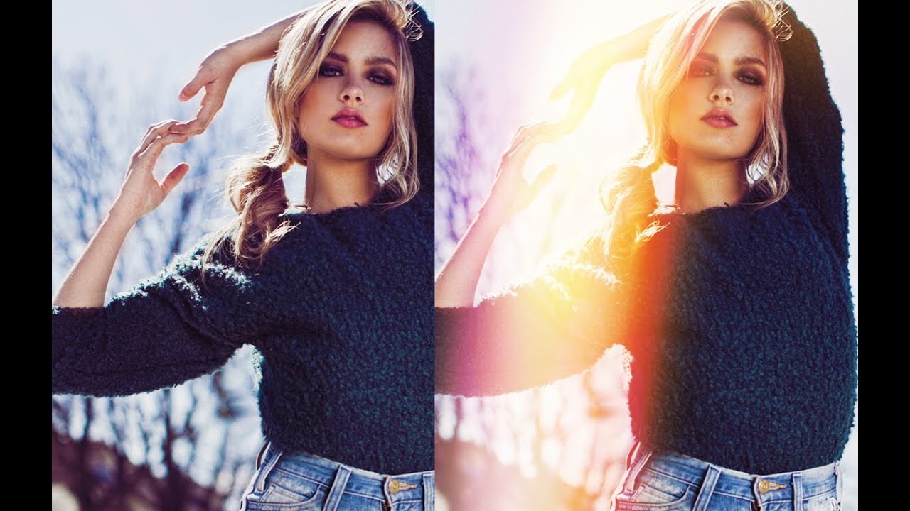
Most of my work lives on the budget end of photography. I shoot with affordable glass, I test cheap accessories so you don’t have to, and I’ve built a decent chunk of my following by proving that expensive gear isn’t the gatekeeper people think it is. But here’s the thing — even when your camera and lens are dialed in, a flat edit can kill a great shot. Post-processing creativity matters, and that’s where tutorials like this one change the game.
In this Jessica Kobeissi tutorial, she walks through a technique I hadn’t seen explained this clearly before: building a colorful lens flare effect entirely from scratch in Photoshop using soft brush strokes and blend modes. No third-party plugins, no stock flare overlays, no light leak presets. Just layers, a brush, and a solid understanding of how Screen and Overlay interact with color. Watch the full tutorial on YouTube
What I like about this approach is how much control it gives you. Stock flare overlays always look slightly wrong because they weren’t made for your image. When you paint the flare yourself, you’re matching it to your actual light source, your color grade, and your subject placement. It takes a few more minutes, but the result looks like it belongs in the photo rather than sitting on top of it.
Step 1: Create a New Empty Layer and Set Up Your Brush
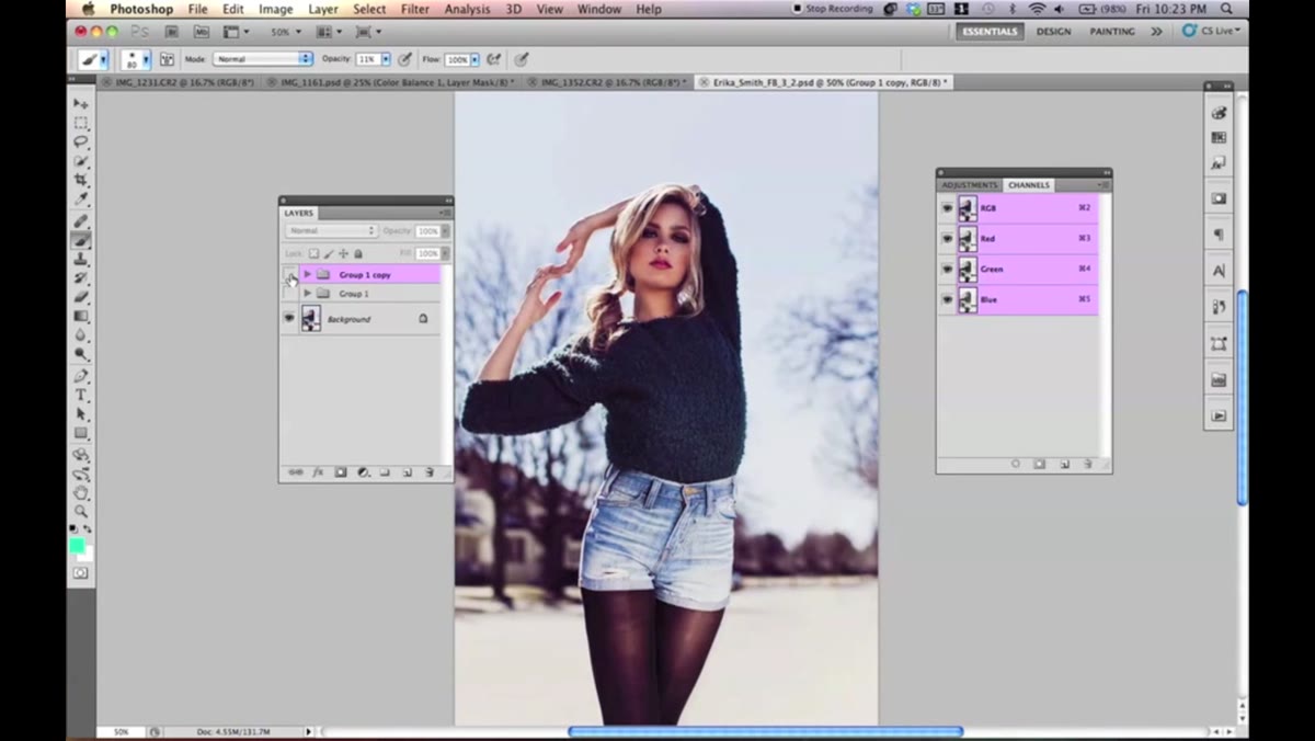 New layer icon clicked, brush tool selected in toolbar
Start by creating a blank layer above your image. You can hit Command+Shift+N or click the new layer icon at the bottom of the Layers panel. This keeps the flare completely non-destructive and editable at any point.
Grab the Brush tool and set the hardness to 0%. This is non-negotiable — a hard-edged brush will create obvious, flat circles instead of the glowing organic look you’re after. Set your brush size to around 400 pixels to start. You’ll adjust this as you go, but a large soft brush gives you that diffused glow that reads as real light.
Step 2: Lay Down a White Base Stroke
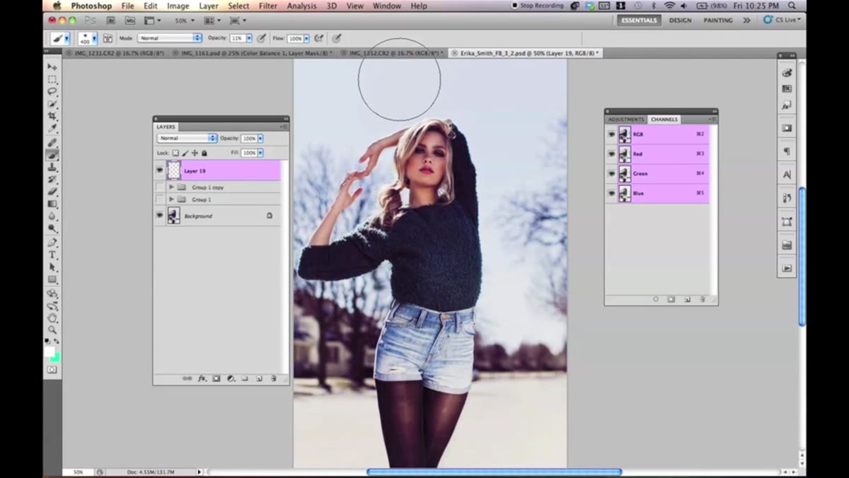 White brush stroke being painted across center of image
Before you touch any color, paint a white stroke across the area where you want the flare to sit. Set your brush opacity to around 44% and think about how a real lens flare behaves — it typically streaks diagonally across the frame from a light source. Make one or two loose, fluid strokes in that direction.
This white layer doesn’t need a blend mode change yet. It acts as the luminance foundation that makes the colors you add next actually pop. Without it, colored layers can look muddy or fail to read against a busy background. Think of it as priming a wall before you paint.
Step 3: Add Your First Color Layer on Screen Mode
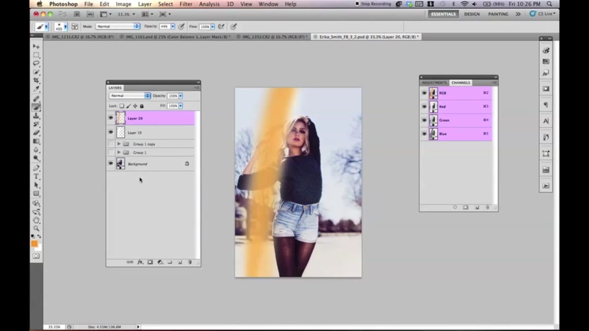 Orange brush layer with Screen blend mode applied in Layers panel
Create a new layer and pick your first color. Jessica goes with orange, and it’s a strong choice because it reads as natural sunlight. Keep your opacity around 44% and paint over roughly the same area as your white base, following the same diagonal direction.
Once you’ve painted the stroke, change that layer’s blend mode to Screen. Screen mode drops the dark values and lets the light, color-rich parts of your stroke glow through without blocking the image underneath. You’ll immediately see the flare start to take shape — the white base you painted earlier is now working with the orange to create that hot center glow.
Step 4: Build Depth With an Overlay Layer of the Same Color
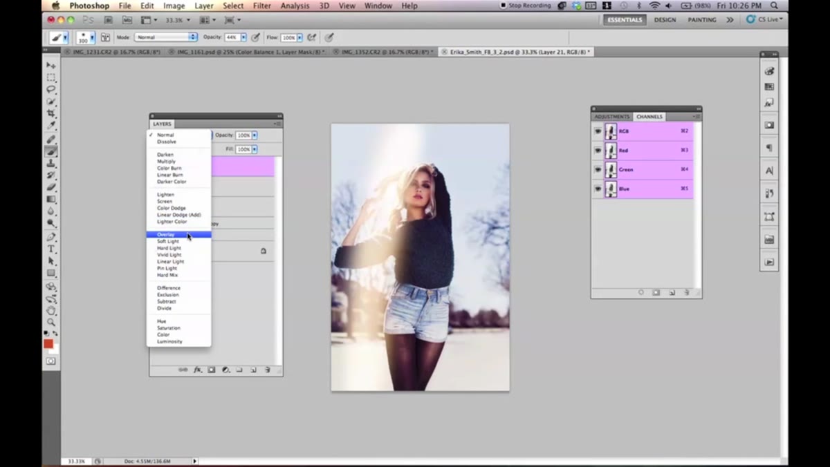 Smaller darker orange brush stroke on Overlay blend mode layer
Duplicate the concept but with a twist. Create another new layer, keep the same orange (or push it slightly darker and more saturated), reduce your brush size, and lower the opacity a bit. Paint over the core of the flare again.
This time, set the blend mode to Overlay instead of Screen. Overlay increases contrast and saturation where it’s applied, so it punches up the intensity right at the center of the flare without blowing out the surrounding areas. The combination of one Screen layer and one Overlay layer of the same color is what gives the flare dimension instead of looking like a simple smear.
Step 5: Introduce a Second Color Using the Same Layered Approach
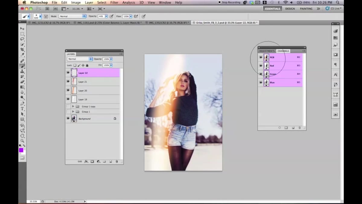 Purple brush stroke added on new Screen mode layer
Now pick a second color to expand the flare’s spectrum. Jessica uses purple, which sits on the opposite end of the warm tones and creates a natural rainbow progression. Create a new layer, keep opacity lower this time, around 30-35%, and use your large soft brush to paint a wider, more diffused stroke that extends slightly beyond the orange.
Set this layer to Screen. Then repeat the process: create another layer, same purple, Overlay mode, and go over the center area again at reduced opacity. The reason for keeping these on separate layers rather than painting them together is simple control. If the purple is too heavy, you can lower that specific layer’s opacity without touching anything else.
Step 6: Tie the Colors Together With a Yellow Overlay Layer
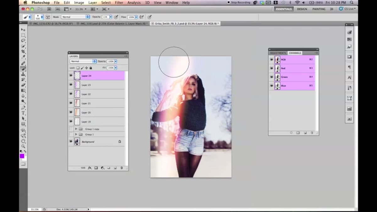 Yellow brush stroke on Overlay blend mode blending warm colors
This step surprised me when I watched it the first time. Jessica adds a yellow layer set to Overlay at a low opacity, around 10-11%, and it acts almost like a color glue. Yellow in Overlay mode warms up the transition zones between your colors and makes the whole flare feel cohesive rather than like separate colored blobs stacked on top of each other.
Keep the opacity low here. The point isn’t to add yellow as a visible element but to let it shift the blending between your warm and cool tones. If you paint it and it looks too obvious, just dial the layer opacity down until it stops calling attention to itself and starts quietly doing its job.
Step 7: Use the Eraser to Refine and Sculpt the Flare
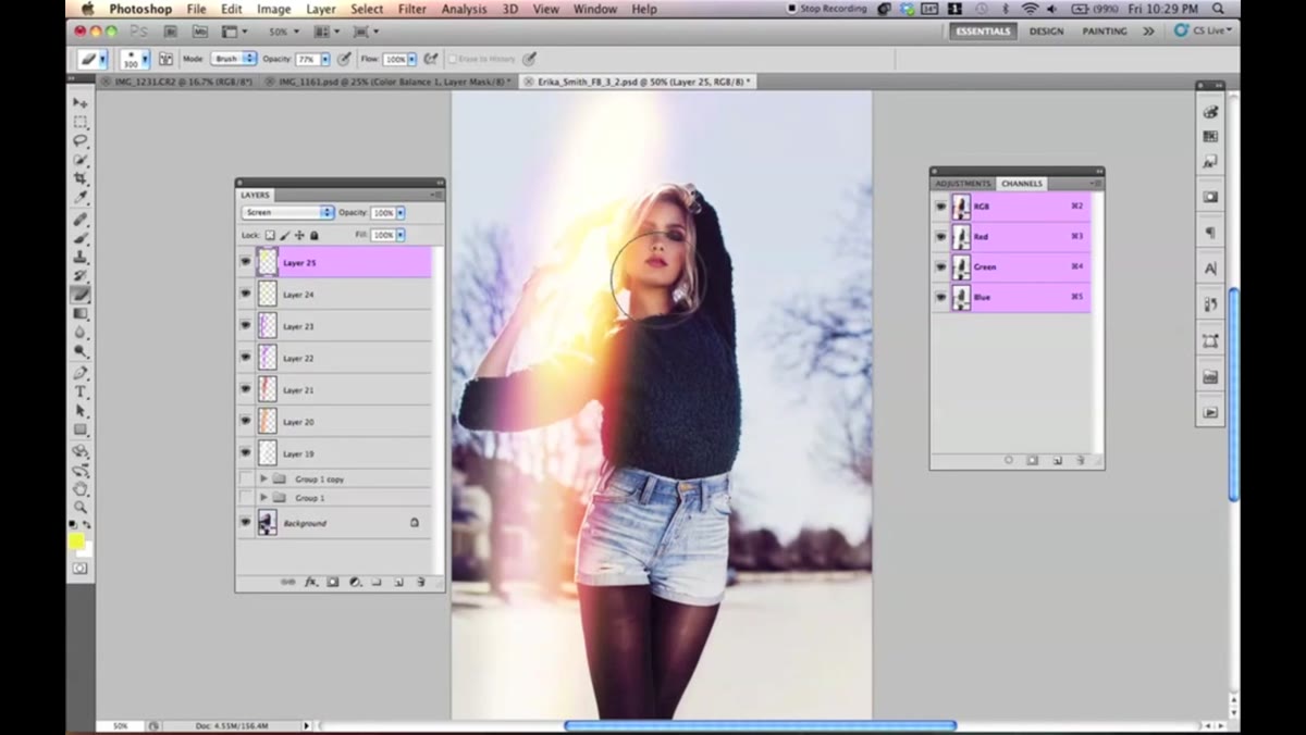 Eraser tool removing flare from areas over the subject’s face
At some point you’ll have painted too much flare over the subject or into areas where it doesn’t belong. Switch to the Eraser tool with the same 0% hardness setting and a large soft brush, and gently remove the effect from areas that should stay clean. Jessica does this particularly around the subject’s face and body.
This is where working on separate layers pays off. You can erase aggressively on one color layer without affecting any of the others. Don’t flatten anything until you’re done.
My Take: This Works Even Better With a Tablet, But Don’t Skip It Without One
I don’t own a drawing tablet. I know, I know. Jessica mentions using one and she’s right that it gives you more fluid, natural-looking strokes. But I’ve run through this technique with a standard mouse and it still produces a solid result — it just takes a bit more patience and more liberal use of the eraser to clean up awkward-looking spots. If you’ve been on the fence about grabbing an entry-level Wacom, this is one of those techniques that would actually justify the purchase. Even the Wacom One starts around $100 new and often shows up refurbished for under $60.
The biggest lesson from this technique is that Photoshop’s blend modes are doing heavy lifting here, not the brush strokes themselves. Screen and Overlay are the whole engine. Once you understand that Screen removes darkness and Overlay amplifies contrast, you can apply that logic to dozens of other light-painting effects beyond lens flares.
Watch the full tutorial on YouTube to see Jessica’s actual results and the final image comparison — seeing her before and after is what sold me on trying this immediately.
Comments (3)
I've been looking for exactly this kind of tutorial. Perfect timing.
Just subscribed. If the rest of your content is this good, I'm in.
Great article! I actually covered something related on my site — the photoshop angle is really complementary to this.
Leave a Comment