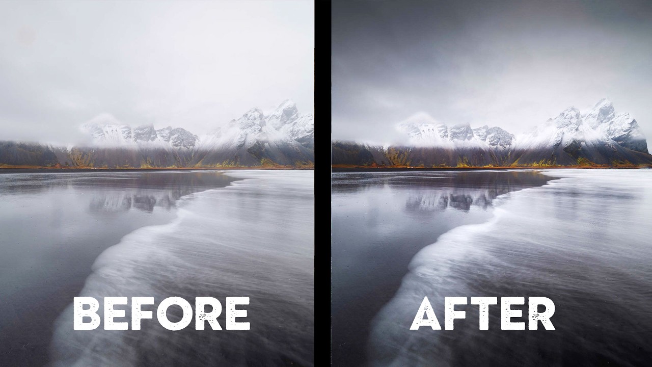
I spend a lot of time hunting deals and testing budget gear, and my whole argument is that the camera isn’t what’s holding most people back. But after watching enough work from photographers at every price point, I’ll admit the honest truth: cheap gear isn’t holding people back either. Composition is. Cropping is. Knowing when to simplify is. Those are free skills, and most of us, myself included, are still building them.
That’s why I kept coming back to this Nigel Danson tutorial. Watch the full tutorial on YouTube. Nigel put out a call to his email list asking for photos to critique. He expected around 50 submissions. He got 750. He went through all of them, pulled out a cross-section of woodland shots, seascapes, and wide vistas, and started pointing out the small things that separate a good photo from a great one. No new cameras needed. No exotic locations. Just sharper decisions at the shooting stage and in post.
What he found, over and over, was the same handful of fixable problems. I’ve broken down his critique process into steps you can apply to your own images right now, whether you shot them yesterday or two years ago.
Step 1: Identify the Actual Subject Before You Do Anything Else
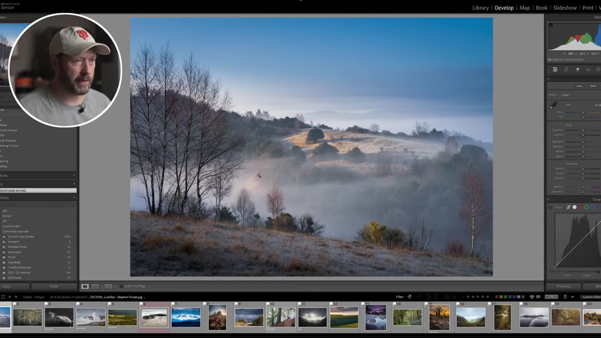 Woodland mist photo with unclear central focus area highlighted
Before you touch a crop or open a slider, ask yourself one question: what is this photo actually about? Nigel’s first critique subject was a misty woodland scene with strong trees on both sides of the frame and a flat, uninteresting middle. The trees were compelling. The center was not. The photo was trying to be about everything, which meant it landed on nothing.
Woodland mist photo with unclear central focus area highlighted
Before you touch a crop or open a slider, ask yourself one question: what is this photo actually about? Nigel’s first critique subject was a misty woodland scene with strong trees on both sides of the frame and a flat, uninteresting middle. The trees were compelling. The center was not. The photo was trying to be about everything, which meant it landed on nothing.
If you can’t name your subject in one word or phrase, the image has a composition problem that no amount of editing will fix. Go back to the frame and ask whether you should have moved left, moved right, or waited for a better moment. If you’re working with existing shots, this question will at least tell you whether a crop can salvage things, or whether the shot is a learning experience and nothing more.
Step 2: Audit Your Sky-to-Ground Ratio
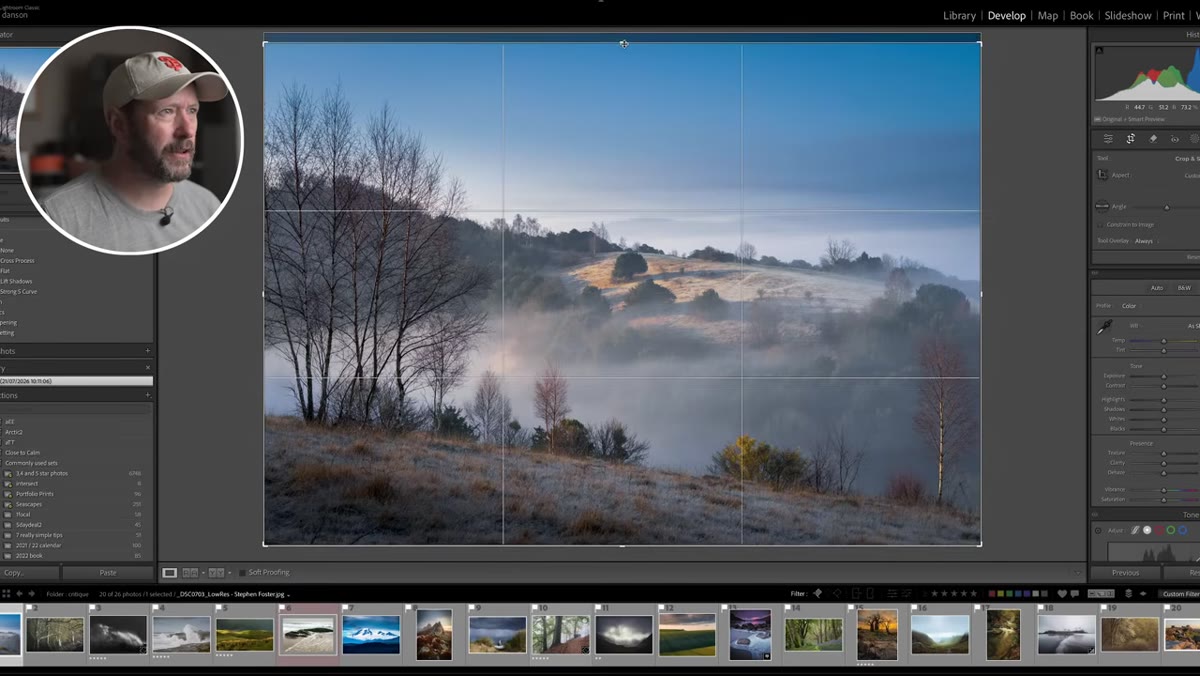 Cropping down the woodland image to reduce excess sky
Too much sky is one of the most common issues Nigel flagged across multiple images. In the misty woodland shot, a heavy crop off the top dramatically improved the balance between foreground, midground, and sky, even though it cut off the tops of the trees. His point: you don’t need to preserve the full height of a tree or a subject if the empty space above it isn’t doing anything useful.
Cropping down the woodland image to reduce excess sky
Too much sky is one of the most common issues Nigel flagged across multiple images. In the misty woodland shot, a heavy crop off the top dramatically improved the balance between foreground, midground, and sky, even though it cut off the tops of the trees. His point: you don’t need to preserve the full height of a tree or a subject if the empty space above it isn’t doing anything useful.
A rough mental check that works for me - if the sky has no clouds, no color, and no texture worth showing, it’s probably just dead space. Try cropping it to one-third or less of the frame and see if the image gets stronger. Most of the time it does.
Step 3: Simplify by Removing Distracting Corners
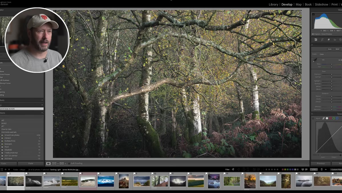 Birch tree photo with bottom-right corner cropped out in demo
Nigel’s second image was a beautiful birch woodland shot with golden autumn leaves. Strong edit, good depth of field, fast enough shutter speed to freeze any leaf movement. His only note was a small patch of ferns in the bottom right corner. Not terrible, but not enough to earn their place in the frame. His fix was a crop that cut them out entirely, turning a slightly busy composition into a clean, focused one.
Birch tree photo with bottom-right corner cropped out in demo
Nigel’s second image was a beautiful birch woodland shot with golden autumn leaves. Strong edit, good depth of field, fast enough shutter speed to freeze any leaf movement. His only note was a small patch of ferns in the bottom right corner. Not terrible, but not enough to earn their place in the frame. His fix was a crop that cut them out entirely, turning a slightly busy composition into a clean, focused one.
Corners are where compositions leak. Your eye wanders to them, and if there’s something sitting there that doesn’t connect to the main subject, it creates a subtle tension that most viewers can’t name but definitely feel. When you’re reviewing your shots, zoom into each corner and ask whether what’s there is adding or just existing.
Step 4: Check Your Verticals
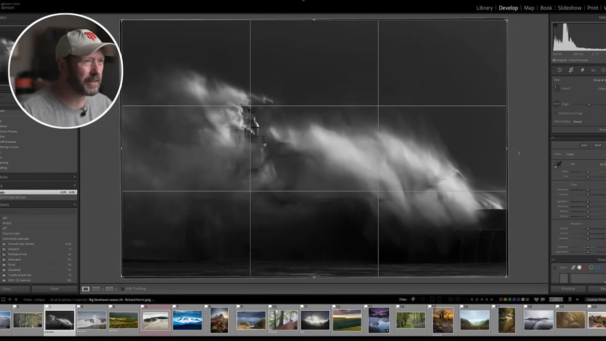 Lighthouse storm photo with slight tilt on the structure
On a stunning lighthouse-in-a-storm image, Nigel’s sharpest technical note was that the lighthouse itself might not be perfectly vertical. At 1/800th of a second in violent conditions, the capture was impressive. But a slightly tilted architectural subject in an otherwise dramatic shot is a distraction that’s easy to miss because you’re so focused on the drama of the scene.
Lighthouse storm photo with slight tilt on the structure
On a stunning lighthouse-in-a-storm image, Nigel’s sharpest technical note was that the lighthouse itself might not be perfectly vertical. At 1/800th of a second in violent conditions, the capture was impressive. But a slightly tilted architectural subject in an otherwise dramatic shot is a distraction that’s easy to miss because you’re so focused on the drama of the scene.
In Lightroom or Camera Raw, use the geometry panel and check the vertical transform slider. For anything with a clear line that should be straight, whether it’s a lighthouse, a tree trunk, a cliff edge, a building, get it level. It takes 20 seconds and it’s one of those things that viewers notice subconsciously even when they can’t articulate why a photo feels slightly off.
Step 5: Match Your Shutter Speed to the Story You Want to Tell
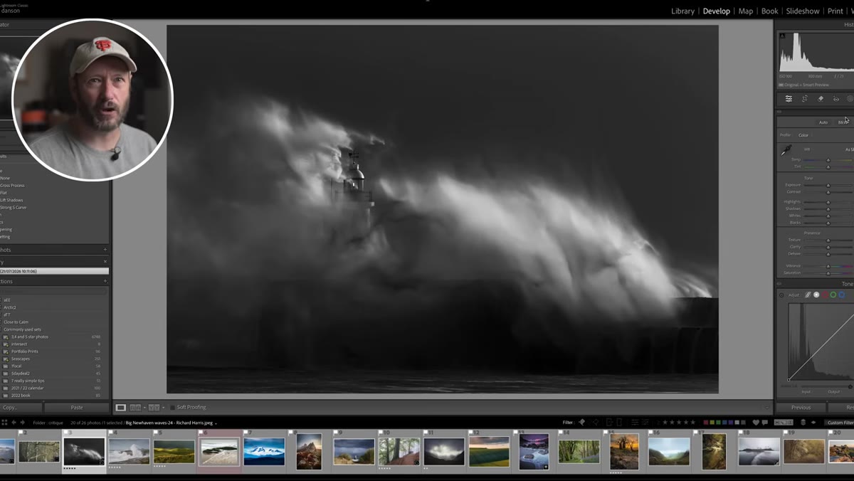 Stormy lighthouse wave detail discussion with shutter speed reference
The lighthouse image raised an interesting tension. Shot at a very fast shutter speed, the water still read as slightly blurry because the conditions were that extreme. Nigel flagged it not as a mistake but as a reminder that shutter speed is a storytelling choice. Fast freezes drama. Slow suggests motion and softness. The shot still worked, but it’s worth being deliberate about which version of a scene you’re actually trying to capture before you press the shutter.
Stormy lighthouse wave detail discussion with shutter speed reference
The lighthouse image raised an interesting tension. Shot at a very fast shutter speed, the water still read as slightly blurry because the conditions were that extreme. Nigel flagged it not as a mistake but as a reminder that shutter speed is a storytelling choice. Fast freezes drama. Slow suggests motion and softness. The shot still worked, but it’s worth being deliberate about which version of a scene you’re actually trying to capture before you press the shutter.
If you’re at the coast or near any moving water, take a test shot at your planned shutter speed, then take one two stops slower, and one two stops faster. Look at all three on the back of the camera before committing. The difference between 1/15s and 1/500s is not just technical. It’s a completely different image with a completely different emotional tone.
Step 6: When in Doubt, Crop to Simplify
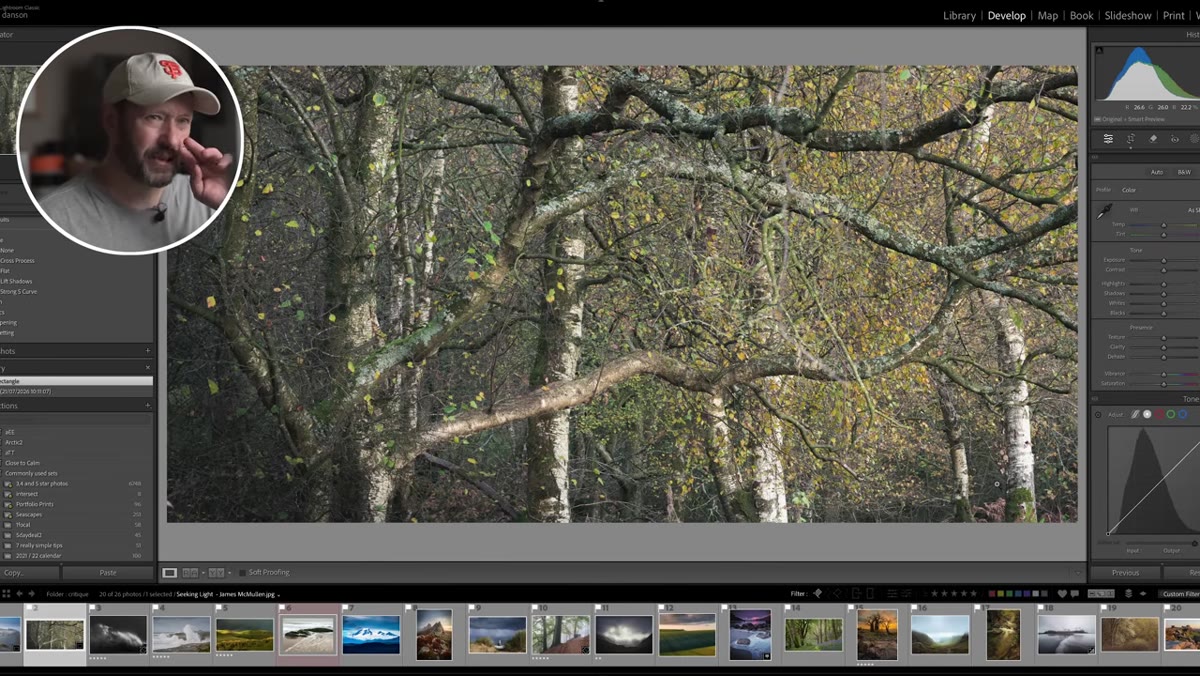 Second crop demo on birch photo to a tighter, cleaner frame
If there’s a single theme running through Nigel’s entire critique session, it’s this: simpler is almost always better. Across the woodland shots, the seascape, and the wide vistas, every time he demonstrated a crop, he was removing something rather than adding it. Removing sky. Removing a distracting corner. Removing a strip of water at the bottom of a frame that wasn’t contributing.
Second crop demo on birch photo to a tighter, cleaner frame
If there’s a single theme running through Nigel’s entire critique session, it’s this: simpler is almost always better. Across the woodland shots, the seascape, and the wide vistas, every time he demonstrated a crop, he was removing something rather than adding it. Removing sky. Removing a distracting corner. Removing a strip of water at the bottom of a frame that wasn’t contributing.
The instinct in the field is to include everything. You’re there, the light is good, you want to capture all of it. But the camera sees differently than your eye, and what felt immersive in person can feel cluttered in a 4x6 print. The crop tool is not an admission that you framed it wrong. It’s just finishing the composition at the desk instead of in the field.
A Note from Someone Who Reviews a Lot of Budget Gear
I’ve run enough side-by-side tests to know that the difference between a $500 camera and a $2,000 one is much smaller than most people think, especially at web resolution. What I see in Nigel’s critique session is proof of that from the other direction. These are photographers shooting in stunning conditions with real skill, and the fixes are all compositional or post-processing. Zero of them require a new camera body.
The next time you’re tempted to think your shots would be better if you had a sharper lens or a higher megapixel count, pull up your last ten photos and run them through Nigel’s checklist instead. Find the subject. Check the sky ratio. Clean up the corners. Straighten the verticals. You’ll find more improvement in that process than in any gear upgrade I’ve ever reviewed.
The one thing to take away from all of this: great photos come from decisive choices, and most of those choices can still be made after the fact with a simple crop. Start there. Watch the full tutorial on YouTube to see Nigel work through all the examples in real time, including several seascape and vista critiques I didn’t cover here.
Comments
Leave a Comment