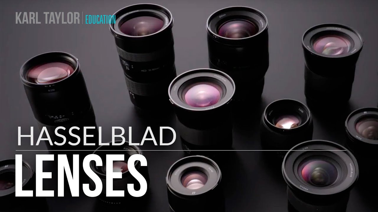
I’ll be honest with you - medium format has never been my world. My whole thing is finding the sharpest bang-for-the-buck glass and proving that a $200 lens can outperform its reputation. But every once in a while I sit down with content from the other end of the price spectrum, not because I’m about to drop five figures on a camera system, but because understanding what “best” actually looks like makes me a better reviewer of everything else. In this Visual Education tutorial on Hasselblad’s lens history and optical performance, the presenter walks through a genuinely practical real-world test: photographing paintings for museum-quality reproduction using a 100 megapixel Hasselblad system. Watch the full tutorial on YouTube
What grabbed my attention wasn’t the gear flex. It was the methodology. Photographing fine art for archival reproduction is one of the most demanding optical challenges there is - you need edge-to-edge sharpness, accurate highlight separation, faithful color rendition, and enough resolving power to produce prints larger than the originals without degradation. That’s a real benchmark, and it maps directly onto problems photographers face in commercial, product, and architectural work. Here’s how the tutorial breaks it down, step by step.
Step 1: Understand the Problem Before You Pick the Tool
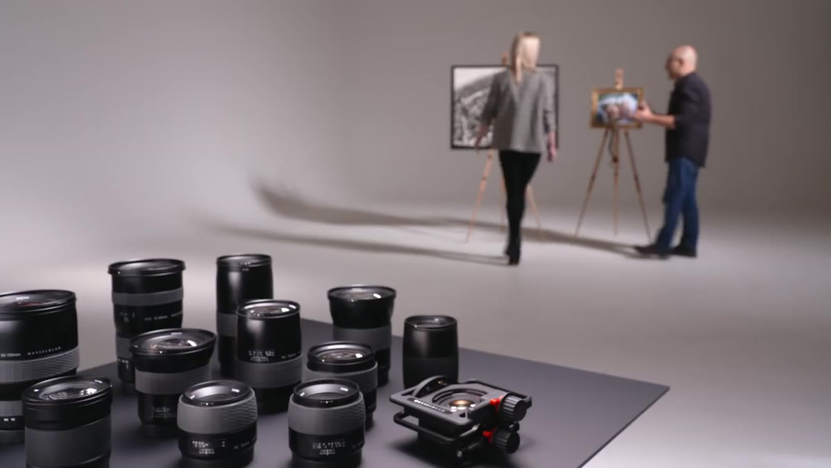 Presenter discussing concerns about shadow and highlight detail
Before any gear gets introduced, the video opens with a practical conversation about what the shoot actually demands. The subject - a series of detailed paintings - raises specific concerns: will the system resolve the fine textural detail in the brushwork, and can it hold both deep shadow information and bright highlight transitions simultaneously? This is exactly the right starting point for any critical shoot. Before you touch a camera, define what “success” looks like in measurable terms. For fine art reproduction, that means corner sharpness, tonal range, and color accuracy, not just “looks good on a phone screen.”
Presenter discussing concerns about shadow and highlight detail
Before any gear gets introduced, the video opens with a practical conversation about what the shoot actually demands. The subject - a series of detailed paintings - raises specific concerns: will the system resolve the fine textural detail in the brushwork, and can it hold both deep shadow information and bright highlight transitions simultaneously? This is exactly the right starting point for any critical shoot. Before you touch a camera, define what “success” looks like in measurable terms. For fine art reproduction, that means corner sharpness, tonal range, and color accuracy, not just “looks good on a phone screen.”
Step 2: Know Your System’s Lineage and Why It Matters
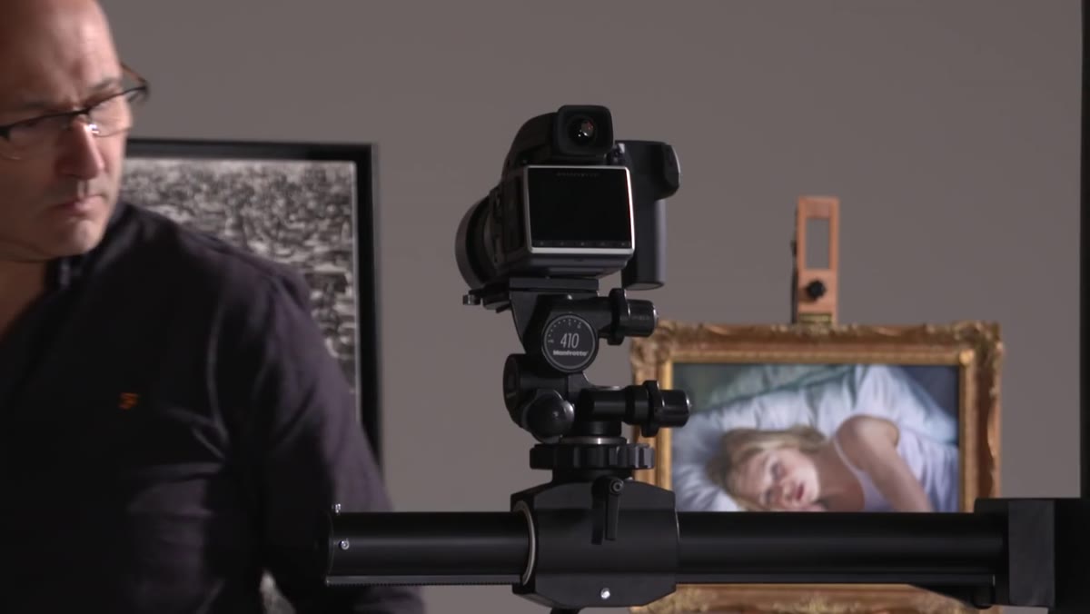 Timeline graphic showing Hasselblad’s historical milestones
The tutorial spends time walking through Hasselblad’s development history, and while this might feel like brand storytelling, there’s a practical reason to pay attention. The optical pedigree here starts with aerial survey work in 1940, moves through the Carl Zeiss Biogon collaboration on the Super Wide in 1954, and includes NASA selecting the system for the Apollo moon missions in 1969. That last point matters because NASA’s requirements for optical performance under extreme conditions pushed the engineering to a level most commercial systems never had to meet. The H-system lenses that arrived in 2002 and the HD lenses released in 2006 are direct descendants of that development arc. When you’re evaluating any lens system, knowing where the engineering investment actually went tells you a lot about where the real-world strengths are.
Timeline graphic showing Hasselblad’s historical milestones
The tutorial spends time walking through Hasselblad’s development history, and while this might feel like brand storytelling, there’s a practical reason to pay attention. The optical pedigree here starts with aerial survey work in 1940, moves through the Carl Zeiss Biogon collaboration on the Super Wide in 1954, and includes NASA selecting the system for the Apollo moon missions in 1969. That last point matters because NASA’s requirements for optical performance under extreme conditions pushed the engineering to a level most commercial systems never had to meet. The H-system lenses that arrived in 2002 and the HD lenses released in 2006 are direct descendants of that development arc. When you’re evaluating any lens system, knowing where the engineering investment actually went tells you a lot about where the real-world strengths are.
Step 3: Match the Focal Length to the Reproduction Task
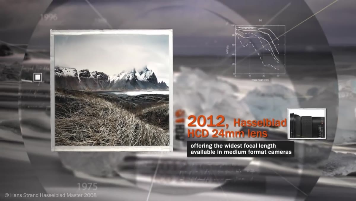 Discussion of the 24mm wide-angle lens for medium format
The video notes that Hasselblad introduced a 24mm focal length in 2012, the widest angle available for medium format at the time. For flat art reproduction this is less critical than for environmental or architectural work, but the principle applies broadly: medium format coverage demands more from wide-angle optics because the larger sensor exposes corner weakness that smaller formats hide. When you’re shooting for reproduction or print, focal length choice isn’t just about framing - it’s about where the optical stress lands on your sensor. Shooting a wide painting with a lens that softens in the corners means your print falls apart exactly where the viewer’s eye travels last.
Discussion of the 24mm wide-angle lens for medium format
The video notes that Hasselblad introduced a 24mm focal length in 2012, the widest angle available for medium format at the time. For flat art reproduction this is less critical than for environmental or architectural work, but the principle applies broadly: medium format coverage demands more from wide-angle optics because the larger sensor exposes corner weakness that smaller formats hide. When you’re shooting for reproduction or print, focal length choice isn’t just about framing - it’s about where the optical stress lands on your sensor. Shooting a wide painting with a lens that softens in the corners means your print falls apart exactly where the viewer’s eye travels last.
Step 4: Evaluate the Digital File Before You Print Anything
 Examining the captured image in Photoshop at full magnification
After the shoot, the presenter pulls the file into Photoshop and examines it methodically rather than just zooming to the center and calling it sharp. The check covers corner-to-corner sharpness, highlight separation in the bright areas of the painting, and shadow detail retention in the darker passages. This is the step most photographers skip, especially when the image looks great on a calibrated monitor at fit-to-screen. If you’re doing any kind of reproduction work - products, documents, artwork - you need to be zooming into the corners of your file before the client ever sees it. A lens that looks perfect at 50% view can reveal real field curvature or chromatic aberration issues at 100%.
Examining the captured image in Photoshop at full magnification
After the shoot, the presenter pulls the file into Photoshop and examines it methodically rather than just zooming to the center and calling it sharp. The check covers corner-to-corner sharpness, highlight separation in the bright areas of the painting, and shadow detail retention in the darker passages. This is the step most photographers skip, especially when the image looks great on a calibrated monitor at fit-to-screen. If you’re doing any kind of reproduction work - products, documents, artwork - you need to be zooming into the corners of your file before the client ever sees it. A lens that looks perfect at 50% view can reveal real field curvature or chromatic aberration issues at 100%.
Step 5: Make a Physical Print Larger Than the Original Subject
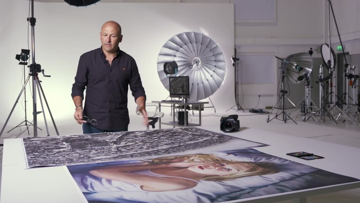 Large format print displayed next to original painting
This is the part of the tutorial that actually impressed me. The presenter produces a large format print that’s at least 50% larger than the original painting and holds it up for direct comparison. The logic is simple but brutal: enlarging beyond the original size amplifies every flaw in the optical chain. If your lens had any resolution weakness, your color profile was slightly off, or your tonal range compressed somewhere in the shadow or highlight regions, a print this size will expose it. The fact that the reproduction holds pin-sharp detail from corner to corner at that scale is a genuine demonstration of what the system is capable of, not a spec sheet talking point.
Large format print displayed next to original painting
This is the part of the tutorial that actually impressed me. The presenter produces a large format print that’s at least 50% larger than the original painting and holds it up for direct comparison. The logic is simple but brutal: enlarging beyond the original size amplifies every flaw in the optical chain. If your lens had any resolution weakness, your color profile was slightly off, or your tonal range compressed somewhere in the shadow or highlight regions, a print this size will expose it. The fact that the reproduction holds pin-sharp detail from corner to corner at that scale is a genuine demonstration of what the system is capable of, not a spec sheet talking point.
Step 6: Verify Shadow and Highlight Detail Separately
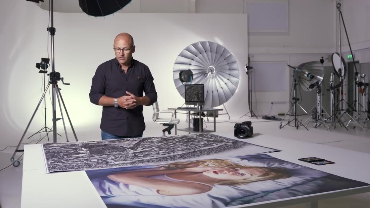 Close inspection of shadow regions and highlight transitions in the print
The final evaluation in the video breaks the print inspection into two separate checks rather than one general “it looks sharp” pass. Shadow detail is examined in the darker areas of the street scene captured in the painting, where separation between tones is hardest to maintain. Then highlight transitions - specifically a building edge against a bright sky reflection on water - are checked for accuracy. The concern was whether closely spaced highlight values would merge or blow out. They didn’t. Running these as two distinct tests rather than one eyeball pass is good practice for any critical imaging work, especially if you’re delivering files that will be printed or published without your supervision.
Close inspection of shadow regions and highlight transitions in the print
The final evaluation in the video breaks the print inspection into two separate checks rather than one general “it looks sharp” pass. Shadow detail is examined in the darker areas of the street scene captured in the painting, where separation between tones is hardest to maintain. Then highlight transitions - specifically a building edge against a bright sky reflection on water - are checked for accuracy. The concern was whether closely spaced highlight values would merge or blow out. They didn’t. Running these as two distinct tests rather than one eyeball pass is good practice for any critical imaging work, especially if you’re delivering files that will be printed or published without your supervision.
What I’d Add From My End of the Price Spectrum
Here’s my honest extension of this: the optical principles demonstrated with a $50,000+ Hasselblad system apply directly to what I test with $300 lenses. Corner sharpness, tonal range, highlight separation - these are the same benchmarks I use in my own comparisons, just at a different ceiling. The methodology in this tutorial is genuinely transferable. If you’re doing product photography, flat lay shooting, or even just trying to figure out whether your budget lens is actually holding up, make a print larger than your subject and examine it in sections. It’s a more honest test than any pixel peeping session on a monitor. The Hasselblad system earns its price tag in a test like this. But the testing framework itself costs nothing.
The single most important takeaway from this tutorial is that optical quality is not proven on a screen - it’s proven in print, at scale, in the corners. Build that test into your workflow regardless of what system you’re shooting with.
Watch the full tutorial on YouTube
Comments (4)
Wow, I had no idea you could do this. Mind blown.
I've been looking for exactly this kind of tutorial. Perfect timing.
Tried this technique this morning. Game changer for real.
Love this. I referenced a similar technique in one of my recent posts. Always good to see other perspectives.
Leave a Comment