I’ve spent the better part of three years arguing that gear doesn’t make the photo. I’ve done blind tests. I’ve shot weddings on entry-level bodies. I have a spreadsheet with 40-something budget lenses ranked by sharpness-per-dollar. My whole thing is that most photographers are buying solutions to problems that don’t exist.
So when I sat down to watch Karl Taylor analyze the Hasselblad Masters 2026 finalists, I expected to feel like a tourist in someone else’s tax bracket. What I didn’t expect was to come away with a list of very concrete, very transferable technique notes that apply whether you’re shooting on a Hasselblad or a crop-sensor body from 2019.
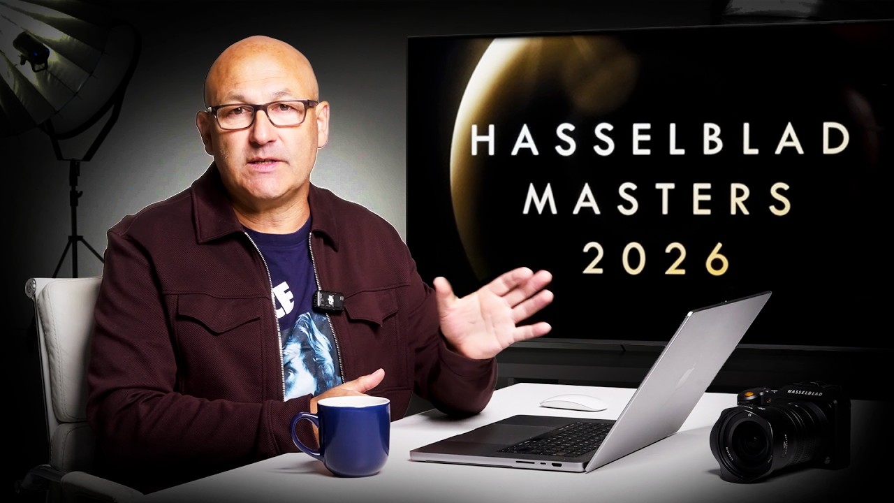
The public voting for Hasselblad Masters 2026 is open now at hasselblad.com, and in this Visual Education video, Karl Taylor, a Hasselblad Global Ambassador, walks through standout finalist images across all seven categories: Architecture, Street, Portrait, Landscape, Art, Wildlife, and Project 21. The breakdown isn’t promotional fluff. He’s dissecting specific technical choices and explaining why they work. That’s where it gets useful.
Long Exposures Aren’t Just for Waterfalls
The architecture finalists that Taylor highlights aren’t using long exposures for the dreamy blurred-water effect you see on every travel photography account. They’re using them to solve a real lighting problem: balancing a complex scene where the interior and exterior exposures are miles apart.
The technique is straightforward. You shoot at dusk or dawn, when the ambient exterior light and your artificial interior light are closer in value. Then you use a long exposure, often several seconds, to let the sensor gather enough of both light sources simultaneously without blowing out the windows or crushing the shadows inside. The result is a frame where you can read the architecture as a whole, not just the parts that happened to be lit correctly.
What makes the finalists’ work stand out is scale. The long exposure isn’t just solving the exposure problem. It’s also letting in enough light to show the full depth of the space, the height of a ceiling, the relationship between a building and its surroundings. That sense of scale is what separates a technically correct architectural photo from one that actually communicates something about a place.
Manual Exposure as a Creative Decision, Not a Last Resort
Taylor’s breakdown of the street photography finalists is the section I kept rewinding. The common thread in the strongest images is deliberate underexposure combined with manual exposure mode. Not “I forgot to check my settings” underexposure. Intentional, considered underexposure.
The photographers are pulling the exposure down to compress the tonal range and push the scene toward drama. When you shoot in auto or even aperture priority on a high-contrast street scene, the camera tries to average everything out. You get a technically balanced image that feels flat. When you lock your exposure manually and accept that the shadows will go dark, you’re making a compositional decision. The light areas become the subject. The dark areas become the frame.
The specific application Taylor points to: set your exposure for the brightest meaningful element in the frame, the face catching a shaft of light, the illuminated doorway, and let everything else fall where it falls. Stop fighting the contrast. Use it.
Concept Before Camera in Art and Portrait Work
The art and portrait categories are where Taylor’s analysis gets more abstract, but there’s still a practical thread. The finalists aren’t just technically proficient. They’re working from a clear concept that the image has to deliver. Human connection. Isolation. The tension between the two.
What that means technically is that every element in the frame, the lighting ratio, the depth of field, the subject’s relationship to empty space, has to serve the concept. It’s not about gear. A shallow depth of field that isolates a subject from their environment is a choice that means something when it reinforces a theme of isolation. It’s just bokeh when it doesn’t.
The practical takeaway is to write down what your image is supposed to make someone feel before you pick up the camera. Then audit your settings against that intention. If your concept is loneliness and you’re shooting at f/8 with a busy background, the settings are working against you.
Where I’d Push Back (a Little)
My one honest reservation with this kind of analysis is that it can make great photography feel like a checklist. Study the finalists long enough and you start to think: long exposure for architecture, manual underexposure for street, concept-first for art. And then you go out and consciously apply those techniques and the work feels mechanical.
The photographers in this competition aren’t executing techniques. They’re solving visual problems they actually care about, and the techniques are the tools they reached for. The difference matters. I’ve shot the same street corner with deliberate underexposure and come back with nothing, because I didn’t have a reason to be there beyond “let’s try the technique.” The frame knew it.
So take the technical notes seriously. But use them to get out of your own way, not to build a new set of rules to follow.
The Real Lesson From Six-Figure Camera Users
The Hasselblad Masters finalists are shooting on some of the most expensive equipment available. That’s worth acknowledging. But what Taylor’s breakdown makes clear is that the decisions separating these images from good-but-forgettable work are decisions any photographer can make: choose your exposure on purpose, commit to a concept, and let contrast do work instead of fighting it.
Those are free. Watch the full video for Taylor’s visual walkthroughs of the actual finalist images, because seeing the before-and-after of these decisions in real photographs is worth more than any written description of them.
Comments
Leave a Comment