I’ll be straight with you: I built this entire site around the idea that gear doesn’t make the photographer. I started with a $300 camera kit and shot a wedding that ended up in a local magazine. So when a video pops up with “Hasselblad” in the title, my instinct is to scroll past it. But this one stopped me cold, and not because of the camera brand.
In this Visual Education tutorial, Karl Taylor, a working commercial photographer and Hasselblad global ambassador, walks through finalists from the Hasselblad Masters 2026 competition. Watch the full tutorial on YouTube What he’s actually doing, underneath the brand context, is breaking down exactly what elevates a photograph from technically competent to artistically compelling. That’s a lesson that transfers to any camera at any price point. The competition itself spans seven categories and accepts entries from photographers worldwide, which means you’re seeing a real cross-section of what serious image-making looks like in 2025.
What caught my attention is that Taylor isn’t just telling you which images look pretty. He’s narrating why they work, the same way a photo editor would. That kind of analytical breakdown is worth more than most paid courses I’ve seen. Here’s what I pulled out of it.
Step 1: Understand the Competition’s Structure Before You Vote (or Enter)
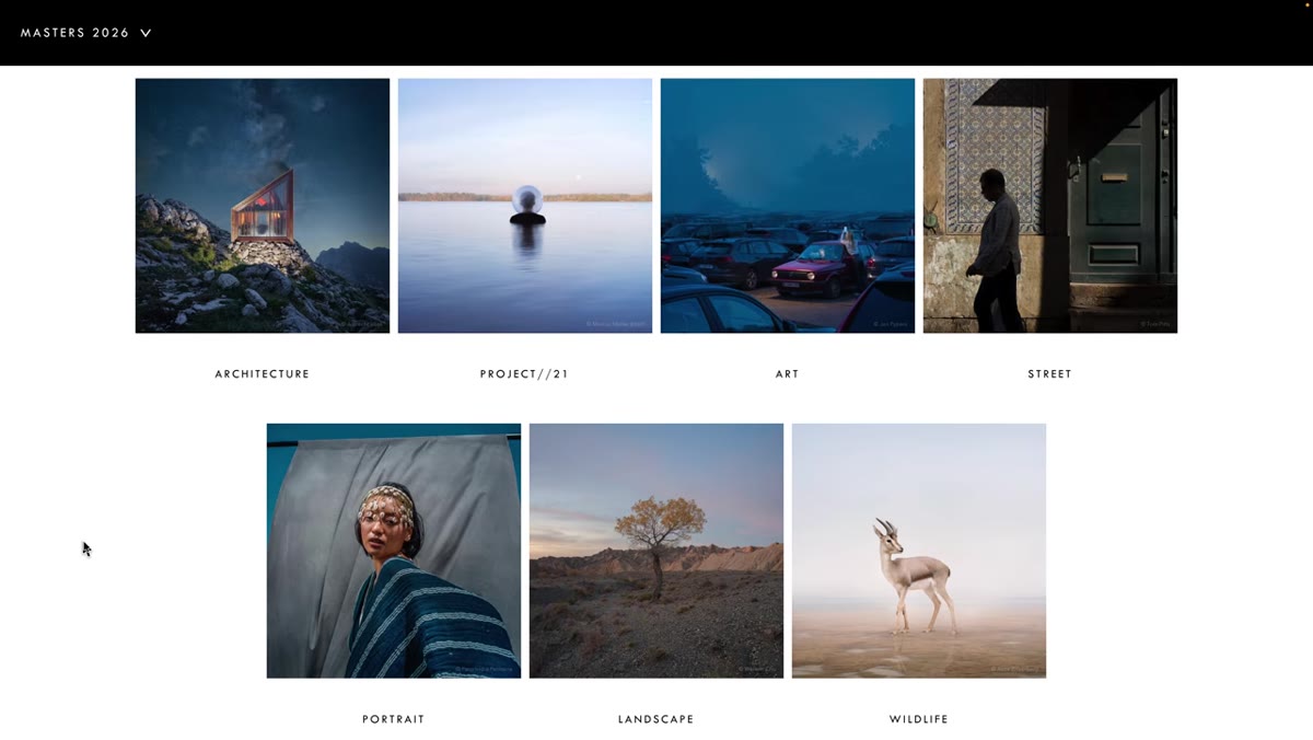 Seven competition categories listed on screen
The Hasselblad Masters 2026 breaks into seven categories: architecture, Project 21 (under-21 photographers only), art, street, portrait, landscape, and wildlife. Each category has 10 finalists, and each finalist submits a portfolio of three images rather than a single shot. Public voting uses a one-to-five star system. Knowing this matters because it reframes how you evaluate images. You’re not just picking a favorite photo, you’re assessing a body of work for consistency, artistic intent, and execution across three related images.
Seven competition categories listed on screen
The Hasselblad Masters 2026 breaks into seven categories: architecture, Project 21 (under-21 photographers only), art, street, portrait, landscape, and wildlife. Each category has 10 finalists, and each finalist submits a portfolio of three images rather than a single shot. Public voting uses a one-to-five star system. Knowing this matters because it reframes how you evaluate images. You’re not just picking a favorite photo, you’re assessing a body of work for consistency, artistic intent, and execution across three related images.
If you’re using this as a learning exercise (and you should), go to the Hasselblad website and vote thoughtfully. Force yourself to articulate why you’re giving something five stars versus three. That friction is where the learning happens.
Step 2: Look for Technical Complexity Serving a Visual Idea
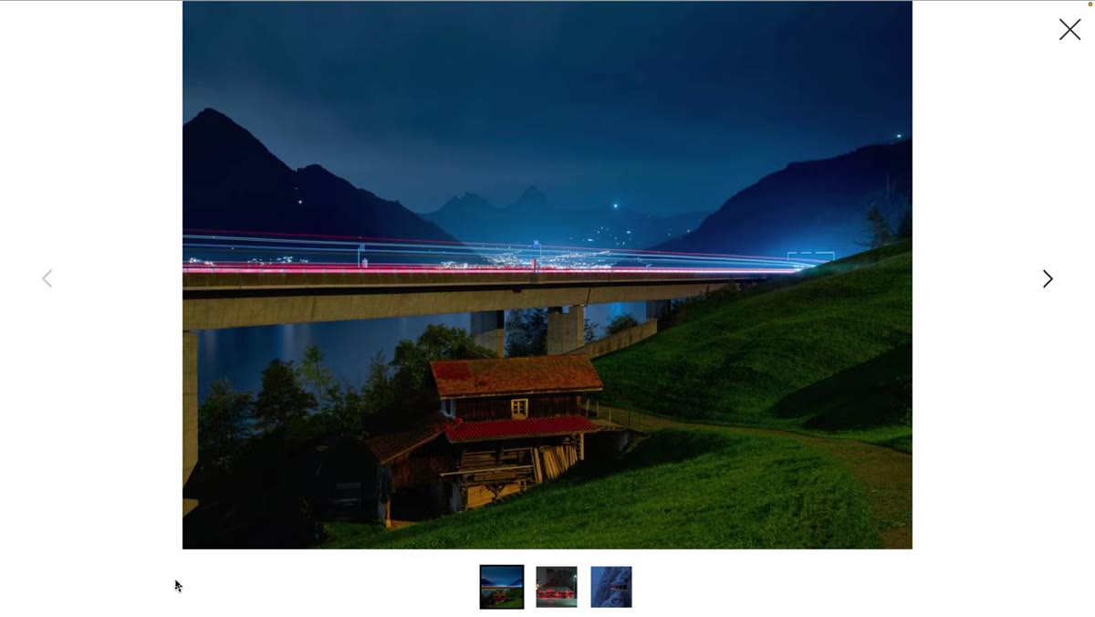 Architecture finalist with long exposure and light trails
Taylor’s first detailed breakdown covers an architecture entry that layers low-light photography, long exposure, ambient sky glow, and traffic light trails, all in a single frame. He’s not impressed by the technique itself. He’s impressed because every technical choice reinforces the central visual idea: new-world infrastructure sitting directly on top of old-world architecture. The exposure balance between the illuminated building, the moving cars, and the sky isn’t just difficult to pull off. It’s doing narrative work.
Architecture finalist with long exposure and light trails
Taylor’s first detailed breakdown covers an architecture entry that layers low-light photography, long exposure, ambient sky glow, and traffic light trails, all in a single frame. He’s not impressed by the technique itself. He’s impressed because every technical choice reinforces the central visual idea: new-world infrastructure sitting directly on top of old-world architecture. The exposure balance between the illuminated building, the moving cars, and the sky isn’t just difficult to pull off. It’s doing narrative work.
The takeaway for your own shooting: before you reach for a technical solution, ask what story it serves. Long exposure is a tool. Contrast is a tool. The question is whether you’re using them intentionally or just because they look cool.
Step 3: Use a Human Element to Establish Scale and Depth
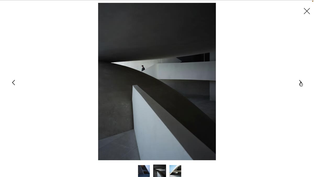 Staircase architecture shot with single figure descending
The second architecture image Taylor analyzes is nearly monochromatic, dominated by geometric lines, curves, and layered tonal values. It’s strong on its own. But he points specifically to the single figure descending a staircase as the element that makes the shot. Without that person, you lose your sense of scale. You also lose a certain emotional depth because the building stops being a space people inhabit and becomes an abstract pattern.
Staircase architecture shot with single figure descending
The second architecture image Taylor analyzes is nearly monochromatic, dominated by geometric lines, curves, and layered tonal values. It’s strong on its own. But he points specifically to the single figure descending a staircase as the element that makes the shot. Without that person, you lose your sense of scale. You also lose a certain emotional depth because the building stops being a space people inhabit and becomes an abstract pattern.
This is something you can apply on your next shoot regardless of what camera you’re holding. If you’re shooting any kind of space, whether it’s a stairwell, a parking garage, or a cathedral, wait for a human element or place one deliberately. One person in the right position transforms geometry into story.
Step 4: Distinguish Between Artistic Architecture and Commercial Architecture
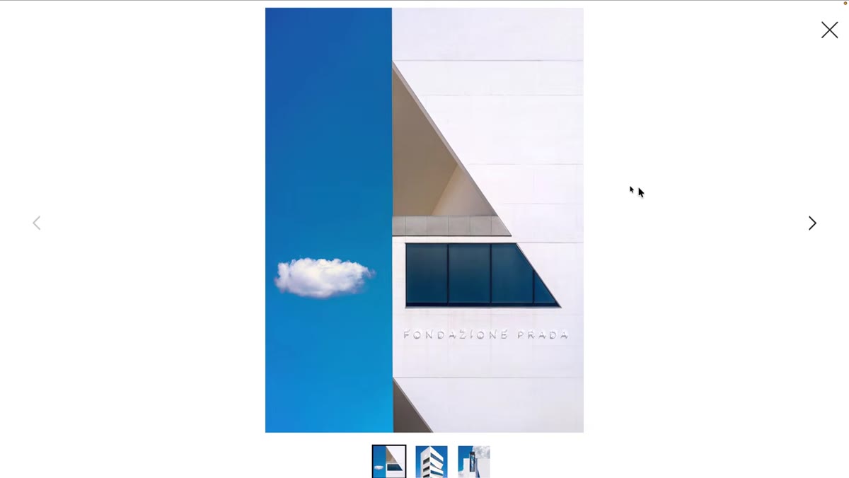 White building with strong shadows and cloud formations
Taylor draws a clear line between two types of architectural photography. Commercial architectural work documents a building for a client: clean light, straight lines, accurate color. The finalists in this competition are doing something different. They’re using buildings as a subject within a broader artistic statement. One entry he covers features a white building photographed against white cloud formations, with hard directional sunlight carving strong shadows across the facade. There are no people, no context clues about location. It’s architectural abstraction.
White building with strong shadows and cloud formations
Taylor draws a clear line between two types of architectural photography. Commercial architectural work documents a building for a client: clean light, straight lines, accurate color. The finalists in this competition are doing something different. They’re using buildings as a subject within a broader artistic statement. One entry he covers features a white building photographed against white cloud formations, with hard directional sunlight carving strong shadows across the facade. There are no people, no context clues about location. It’s architectural abstraction.
Understanding this distinction matters because it changes what you’re optimizing for. In commercial work, you serve the building. In artistic work, you use the building. Both are valid, but mixing up the goal is how you end up with images that feel neither technically clean nor artistically bold.
Step 5: Read an Image’s “Narrative” Before Judging Its Composition
 Ominous architectural subject being introduced
Taylor keeps returning to the idea of narrative: what does the image say to you, independent of technique? He describes one entry as having an “ominous presence,” which is a compositional and tonal choice the photographer made deliberately. The mood isn’t accidental. It’s constructed through framing, lighting, and subject selection working together.
Ominous architectural subject being introduced
Taylor keeps returning to the idea of narrative: what does the image say to you, independent of technique? He describes one entry as having an “ominous presence,” which is a compositional and tonal choice the photographer made deliberately. The mood isn’t accidental. It’s constructed through framing, lighting, and subject selection working together.
When you’re reviewing your own work, try narrating it out loud as if explaining it to someone who can’t see it. If you can’t articulate what the image is saying beyond “it looks cool,” that’s useful feedback. The strongest images in this competition, according to Taylor’s analysis, all have a legible emotional logic.
What Budget Shooters Can Actually Do With This
I’ve run a blind test at a local meetup where nobody could reliably separate shots from a $500 camera versus a $2000 one. Composition, light reading, and intentionality were the deciding factors every single time. Watching Taylor dissect these Hasselblad Masters entries confirms what I keep coming back to: the skills he’s describing have nothing to do with sensor size or dynamic range.
The Project 21 category is especially worth your attention if you’re newer to photography. These are photographers 21 and under competing against genuinely sophisticated entries, and some of them are holding their own. Study those portfolios specifically. The constraints of youth and presumably tighter budgets don’t seem to be the limiting factor. The analytical framework Taylor demonstrates here, asking what technical choices serve which visual ideas, is something you can build into how you shoot today with whatever you’re carrying.
The single most important thing I took from Taylor’s breakdown is this: every element in a competition-worthy image is load-bearing. Nothing is there by accident. Not the person on the stairs, not the traffic trails, not the clouds against the white wall. When you start shooting with that standard in mind, your camera becomes almost irrelevant.
Watch the full tutorial on YouTube and spend time on the actual Hasselblad Masters voting page while it’s open. Use it as a free masterclass in what serious photography looks like across seven completely different disciplines.
Comments (4)
Simple but effective. Sometimes that's all you need.
Just used this on a wedding shoot edit. Client was thrilled.
Been doing this wrong for years apparently. Thanks for the wake-up call.
Printing this out and pinning it next to my monitor. That good.
Leave a Comment