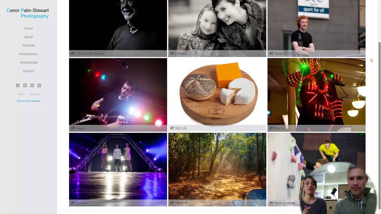
I used to think a photography portfolio was just a place to dump your best shots. Gallery page, contact form, done. Then I spent a morning watching Tony and Chelsea Northrup tear apart real photographer websites on camera, and I realized I had been thinking about it completely wrong. A portfolio isn’t a gallery. It’s a sales page that happens to have pictures on it. Every design choice either builds trust with a potential client or quietly kills the booking.
In this Tony & Chelsea Northrup tutorial, the couple works through multiple real-world portfolios submitted by their readers, calling out specific wins and mistakes with the kind of directness most photography educators avoid. What makes it useful isn’t the praise. It’s the pattern. The same problems keep appearing across different photographers’ sites, and once you see the pattern, you cannot unsee it on your own portfolio either.
This isn’t a tutorial about camera settings or lighting ratios. It’s about the thing most photographers neglect until they’re wondering why nobody is emailing them back.
Step 1: Strip the Visual Noise from Your Homepage
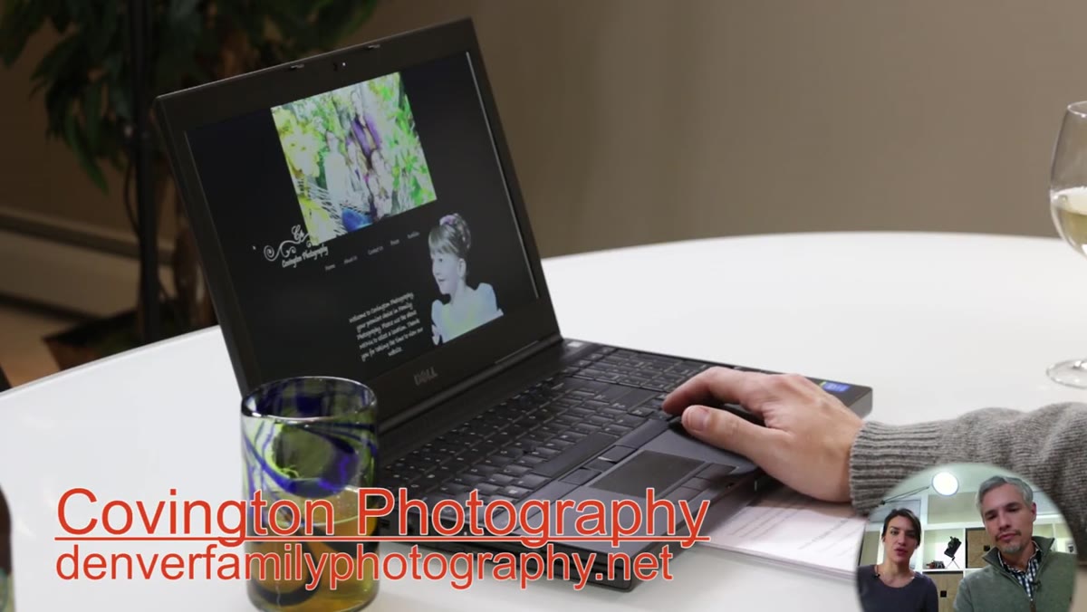 Before and after comparison of Covington Photography website redesign
The first site Tony and Chelsea review shows a dramatic before-and-after. The original version had a wood-grain background, misaligned images, and a layout that competed with itself for attention. The updated version is clean, simple, and immediately readable. The lesson isn’t subtle: your homepage background, font choices, and decorative elements should disappear so the photos can do the talking.
Before and after comparison of Covington Photography website redesign
The first site Tony and Chelsea review shows a dramatic before-and-after. The original version had a wood-grain background, misaligned images, and a layout that competed with itself for attention. The updated version is clean, simple, and immediately readable. The lesson isn’t subtle: your homepage background, font choices, and decorative elements should disappear so the photos can do the talking.
If your site has a textured background, multiple competing font styles, or images that feel randomly placed, strip it back. Pick one neutral background color (white or very dark gray work for most photography styles), one font family, and build from there. The photos are the product. Everything else is packaging.
Step 2: Put Your Face on the Site
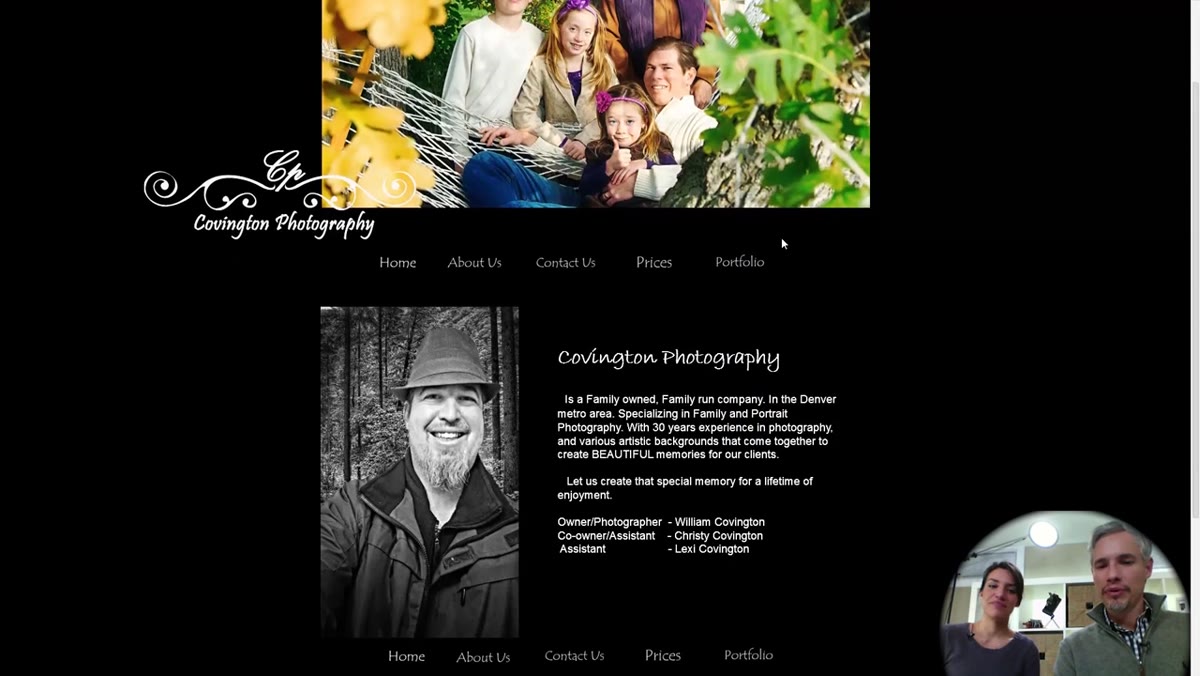 Photographer’s headshot displayed on homepage with friendly expression
This one surprised me when I first heard it, but Tony and Chelsea are emphatic: potential clients want to know they’re hiring a human being they can feel comfortable around. A headshot on your homepage, specifically one where you look approachable and friendly, does real conversion work before a single email is sent.
Photographer’s headshot displayed on homepage with friendly expression
This one surprised me when I first heard it, but Tony and Chelsea are emphatic: potential clients want to know they’re hiring a human being they can feel comfortable around. A headshot on your homepage, specifically one where you look approachable and friendly, does real conversion work before a single email is sent.
You don’t need a professional branding shoot for this. A clean, well-lit photo of you smiling, holding a camera or not, is enough. The point is presence. Clients booking a photographer for a wedding or family session are also booking a person they’ll spend hours with. Give them a face to trust before they ever reach out.
Step 3: Show Your Prices
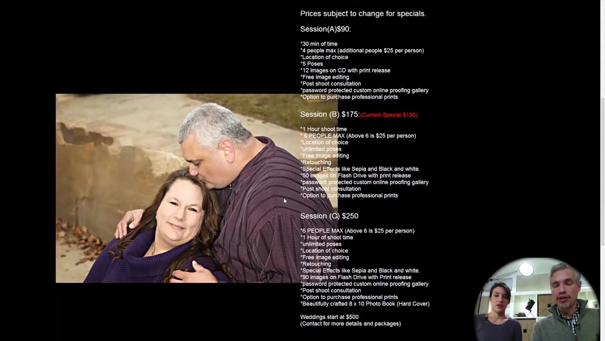 Pricing section visible on photographer’s website
Photographers love to hide their pricing behind a contact form. I get the logic: you want the conversation first. But Tony and Chelsea flag visible pricing as a clear positive. When a potential client can see your rates without having to ask, you filter out bad fits immediately and build credibility with the right ones.
Pricing section visible on photographer’s website
Photographers love to hide their pricing behind a contact form. I get the logic: you want the conversation first. But Tony and Chelsea flag visible pricing as a clear positive. When a potential client can see your rates without having to ask, you filter out bad fits immediately and build credibility with the right ones.
Keep the pricing section clean and separated visually from other content. Tony mentions a specific issue with one site where the price list overlapped with a photo, making both harder to read. Give your numbers room to breathe. A simple table or tiered list works fine.
Step 4: Unify Your Site’s Navigation and Interface
 Two different menu systems visible when navigating between site pages
This is the most technical critique in the review, and it’s one almost nobody talks about. One photographer was running their main site on one platform and linking the portfolio section out to a separately hosted gallery. The result was two different navigation menus, two different fonts, and a jarring shift in experience the moment you clicked into the work.
Two different menu systems visible when navigating between site pages
This is the most technical critique in the review, and it’s one almost nobody talks about. One photographer was running their main site on one platform and linking the portfolio section out to a separately hosted gallery. The result was two different navigation menus, two different fonts, and a jarring shift in experience the moment you clicked into the work.
Tony’s recommendation is direct: pick one platform and run everything through it. The moment a visitor has to mentally “re-learn” your site navigation, you’ve introduced friction. Friction kills bookings. Whether you use Squarespace, Format, or any other portfolio platform, the goal is a seamless experience from the homepage to the contact form. Consistency reads as professionalism even when the visitor can’t articulate why.
Step 5: Show Range, Not Just Volume
 Wildlife portfolio gallery showing varied species and compositions
The second photographer reviewed, Wendy, shoots nature and wildlife. Chelsea’s biggest compliment is that the portfolio shows genuine variety. Different animals, different lighting conditions, different compositions. Then Chelsea draws a sharp contrast: some photographer sites include a wildlife or landscape section that’s clearly all from one good afternoon in the field. Lots of images, almost no range.
Wildlife portfolio gallery showing varied species and compositions
The second photographer reviewed, Wendy, shoots nature and wildlife. Chelsea’s biggest compliment is that the portfolio shows genuine variety. Different animals, different lighting conditions, different compositions. Then Chelsea draws a sharp contrast: some photographer sites include a wildlife or landscape section that’s clearly all from one good afternoon in the field. Lots of images, almost no range.
When you’re curating your portfolio, resist the urge to include every keeper from your best shoot. Instead, ask whether each image adds something visually distinct. A portfolio with 15 images that feel like they were taken across 15 different sessions tells a story of consistency and experience. One with 40 images from the same day tells a different story.
Step 6: Give Your Images Room to Breathe in the Layout
 Portfolio images crowded into corner of page layout
Tony and Chelsea note that Wendy’s photography is genuinely strong, but the site layout is working against her. The images are bunched into a tight cluster rather than displayed with spacing that lets each one land properly. Even great photos can look mediocre when they’re crammed together.
Portfolio images crowded into corner of page layout
Tony and Chelsea note that Wendy’s photography is genuinely strong, but the site layout is working against her. The images are bunched into a tight cluster rather than displayed with spacing that lets each one land properly. Even great photos can look mediocre when they’re crammed together.
This is a platform and template choice more than a photography choice. When you’re selecting a portfolio template, test it with your actual images at actual size. Look at how much white space surrounds each photo, whether horizontal and vertical images display consistently, and whether the grid calls attention to itself or disappears behind the work. If the layout is fighting your photos, the layout is the wrong layout.
What I’d Add From My Own Experience
I’ve built and rebuilt my own photography and gear review pages more times than I want to count, and the mistake I kept making was treating the portfolio as an afterthought. I’d spend hours optimizing product review pages for click-throughs and then toss my own photography work onto a default template and call it good.
The thing Tony and Chelsea’s review makes clear is that the same principles that make a product page convert, clear hierarchy, visible trust signals, consistent branding, apply directly to a photography portfolio. A face photo is a trust signal. Prices are a trust signal. A unified navigation is a credibility signal. None of this requires expensive gear or a $5,000 website build. It requires treating your portfolio like it’s doing a job, because it is.
The single biggest takeaway from this review session: your portfolio is not a personal archive. It is the first conversation you have with every potential client who will never meet you in person. Make that conversation clear, warm, and friction-free, and you’ve already done more than most photographers ever bother to do.
Watch the full tutorial on YouTube to see Tony and Chelsea walk through each site in real time. Seeing the actual before-and-after on the Covington Photography site alone is worth the watch.
Comments
Leave a Comment