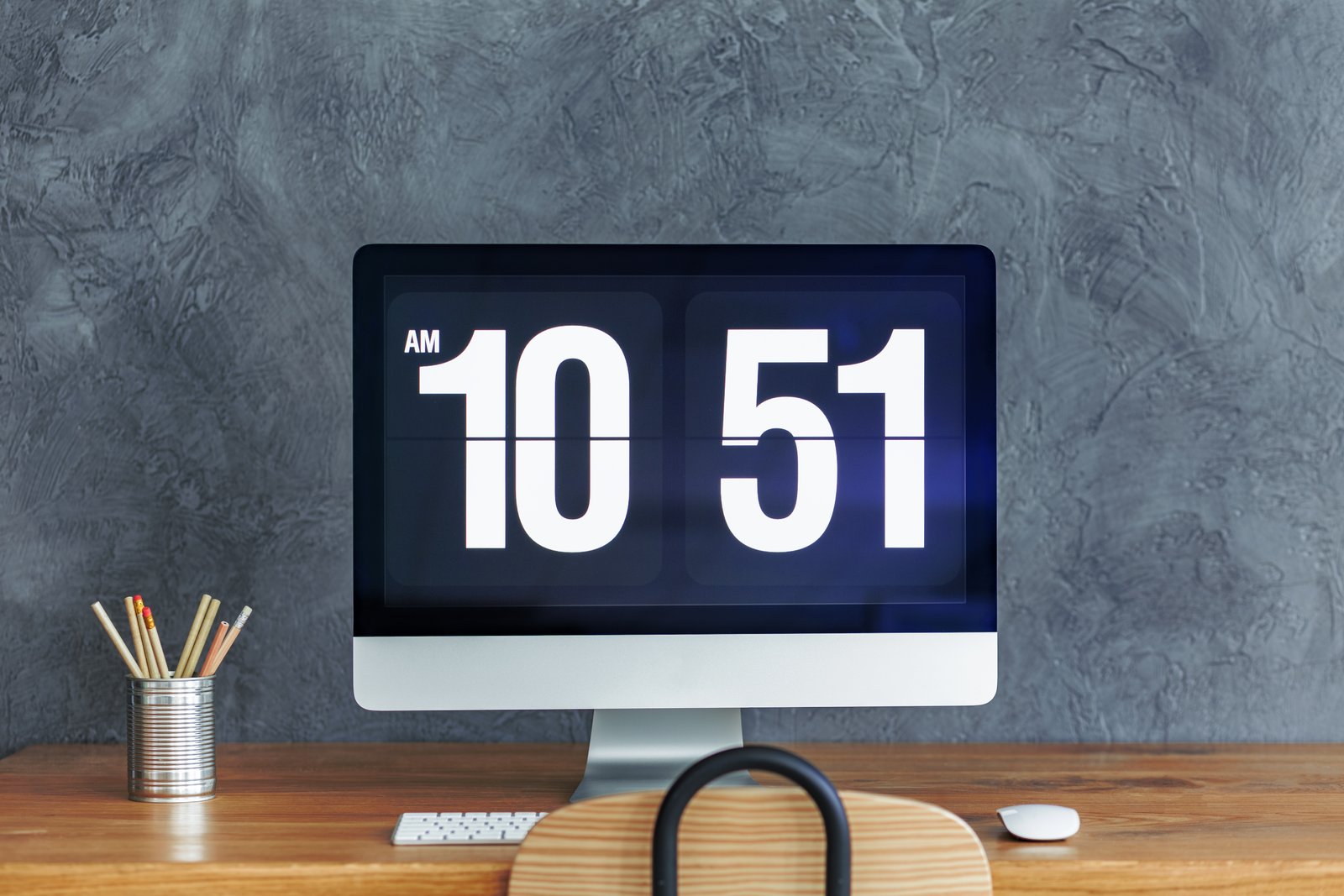
I printed a 16x20 of a portrait last year that looked perfect on my screen. Warm skin tones, rich shadows, clean highlights. It came back from the lab looking like the subject had mild jaundice. The yellows were cranked, the whites were cream, and I had zero idea it was happening while I was editing. That print cost me $40 and two hours of editing time. The fix cost me $100 and about 20 minutes of setup. I should have done it years earlier.
Why Your Eyes Can’t Save You Here
Here’s what’s actually happening when you edit on an uncalibrated monitor. Every display ships from the factory with a color profile baked in, and that profile drifts over time as the backlight ages. What looks neutral gray to you might be pulling slightly blue or warm. Your eyes adapt. You compensate in your edits without realizing it. Then someone views your files on a different screen, or you send them to print, and everything shifts because your baseline was wrong the whole time.
The color space matters too. Most consumer monitors default to sRGB, which covers about 99% of the sRGB gamut on a good day, but budget panels often oversaturate reds and greens to look “vivid” in a store display. If you’re editing in that environment, your colors feel punchy and vibrant, and you pull them back. Then your client opens the file on a calibrated screen and wonders why everything looks muted and gray. This isn’t a talent problem. It’s a hardware and calibration problem.
The Minimum Viable Calibration Setup
You don’t need a $500 colorimeter to solve this. The X-Rite ColorMunki Smile runs about $90 on Amazon and handles sRGB calibration well enough for most photographers who aren’t doing commercial print work. If you want to step up, the Datacolor Spyder X Pro sits around $150 and gives you more control over target gamma, white point, and luminance.
The target settings I use: gamma 2.2, white point D65, and luminance around 100-120 cd/m2 for a room with normal ambient light. If you’re in a bright studio or editing near a window, you might push to 140. Don’t try to eyeball luminance by feel. The software that ships with both of those colorimeters will walk you through the measurement process step by step, and the whole thing takes about 15 minutes.
Run calibration every 4-6 weeks. Backlights drift faster than most people expect, especially in the first few hundred hours of use on a new panel.
Picking the Right Panel Without Overpaying
The monitor market has a lot of noise in it. You’ll see $800 panels marketed to photographers with specs that sound impressive, and you’ll also find $250 panels that, after calibration, perform almost identically for most shooting scenarios.
The BenQ SW272U is genuinely excellent if you’re doing serious print work or commercial color grading. It covers 99% of Adobe RGB and has a built-in hood. But if you’re a portrait or wedding photographer delivering JPEGs and web-optimized files, the ASUS ProArt PA278CV at around $350 is hard to beat. It covers 100% of sRGB and about 75% of Adobe RGB, ships with a reasonably accurate factory calibration, and has USB-C with 65W power delivery, which matters if you’re running a laptop setup.
For anyone starting out or working on a tight budget: the LG 27UK850-W can be found refurbished for under $200 and, once calibrated, does honest work. I know people who’ve used that panel professionally for years.
What Good Looks Like After Calibration
Once your monitor is calibrated, soft proofing in Lightroom Classic actually becomes useful. Go to View, then Soft Proofing, and select the ICC profile for your specific printer and paper combination. Most pro labs provide downloadable ICC profiles on their websites. Mpix, Miller’s, and Bay Photo all do. This shows you, before you print, how the file will actually render on that paper stock.
The first time I did this after getting a calibrated workflow set up, I caught a shadow clipping issue on a landscape file I’d been about to send for a large print order. Soft proofing flagged it in about 30 seconds. That’s the difference between a $12 test print and a wasted $80 canvas.
The Part Nobody Tells You About Room Light
Calibration only holds if your editing environment stays consistent. A monitor calibrated in a dim room at night will look different in a sunlit space at noon, and not because the calibration changed, but because your eyes are adapting to the ambient light and interpreting the screen differently.
Use a monitor hood if you’re near windows. They’re unglamorous and they work. The ones that ship with high-end monitors are fine, but a $20 universal hood from Amazon does the same job. Keep your walls a neutral gray if you can. Bright white or colored walls reflect onto your screen and shift your color perception. This sounds like overthinking until the first time you catch yourself editing in a room with a red accent wall and wonder why everything you export looks slightly cyan.
Get your monitor calibrated, keep your room light consistent, and soft proof before you print. Everything else in your editing workflow is just adjusting sliders.
Comments (2)
The tip about your monitor is lying to you h was the missing piece for me. Thank you.
This saved me so much time on my last edit. Wish I'd found this sooner.
Leave a Comment