Most camera debates stop at the body. People obsess over sensor specs, button layouts, and which brand has the better JPEG rendering, but they never stop to ask: what does the glass actually do to your image? I’ve been down that rabbit hole more times than I can count, and it’s the lens lineup that usually makes or breaks a system decision for me. When I’m helping someone pick their first mirrorless kit, the body is almost secondary to whether that ecosystem can deliver sharp, usable images across a range of focal lengths without demanding a second mortgage.
In this Tony & Chelsea Northrup tutorial, Watch the full tutorial on YouTube, Tony runs a controlled, tripod-based sharpness comparison across the most popular APS-C lenses from Sony and Fuji. The goal is practical: help people make smarter first-system decisions, not just crown a winner for bragging rights. I found it genuinely useful because it goes lens-by-lens rather than throwing a single sample image at you and calling it done. Here’s what he covers, broken down so you can follow the logic without needing to pause and rewind.
Step 1: Understand the Testing Setup Before You Trust the Results
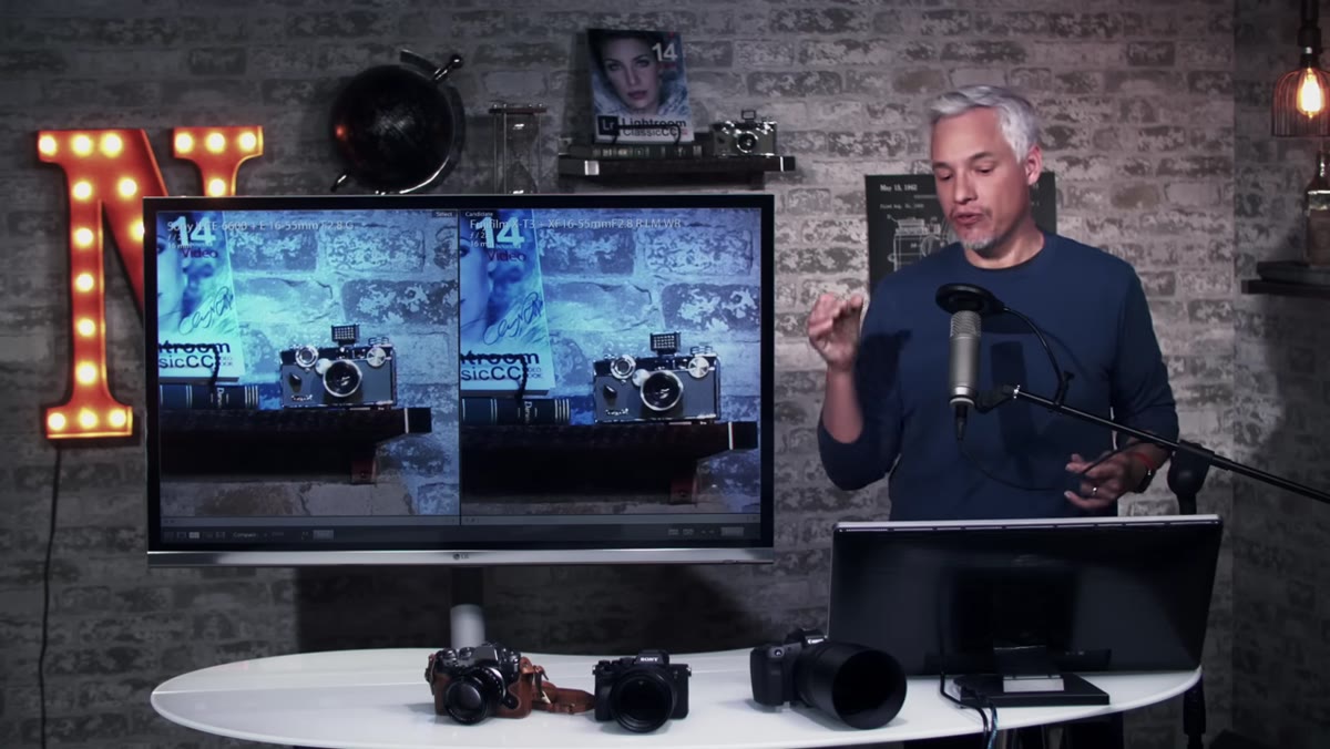 Tripod-mounted cameras side by side on test scene
Before you draw any conclusions from a sharpness test, you need to know whether the test is actually controlled. Tony shoots both systems on a tripod, refocuses multiple times per shot, and evaluates the footage in 4K so pixel-level differences are actually visible. If you’re running your own informal comparisons at home, replicate this: lock your camera down, use a remote shutter or 2-second timer, and shoot the same subject from the same distance. A single handheld shot proves nothing.
Tripod-mounted cameras side by side on test scene
Before you draw any conclusions from a sharpness test, you need to know whether the test is actually controlled. Tony shoots both systems on a tripod, refocuses multiple times per shot, and evaluates the footage in 4K so pixel-level differences are actually visible. If you’re running your own informal comparisons at home, replicate this: lock your camera down, use a remote shutter or 2-second timer, and shoot the same subject from the same distance. A single handheld shot proves nothing.
The test scene includes fine text, book bindings, and graphic elements near the frame corners. That’s intentional. Center sharpness is where most lenses shine. Edge and corner sharpness is where they separate themselves, and it’s also the zone that matters most for landscape and architecture shooters.
Step 2: Compare the Premium Zoom Lenses at Wide and Long Ends
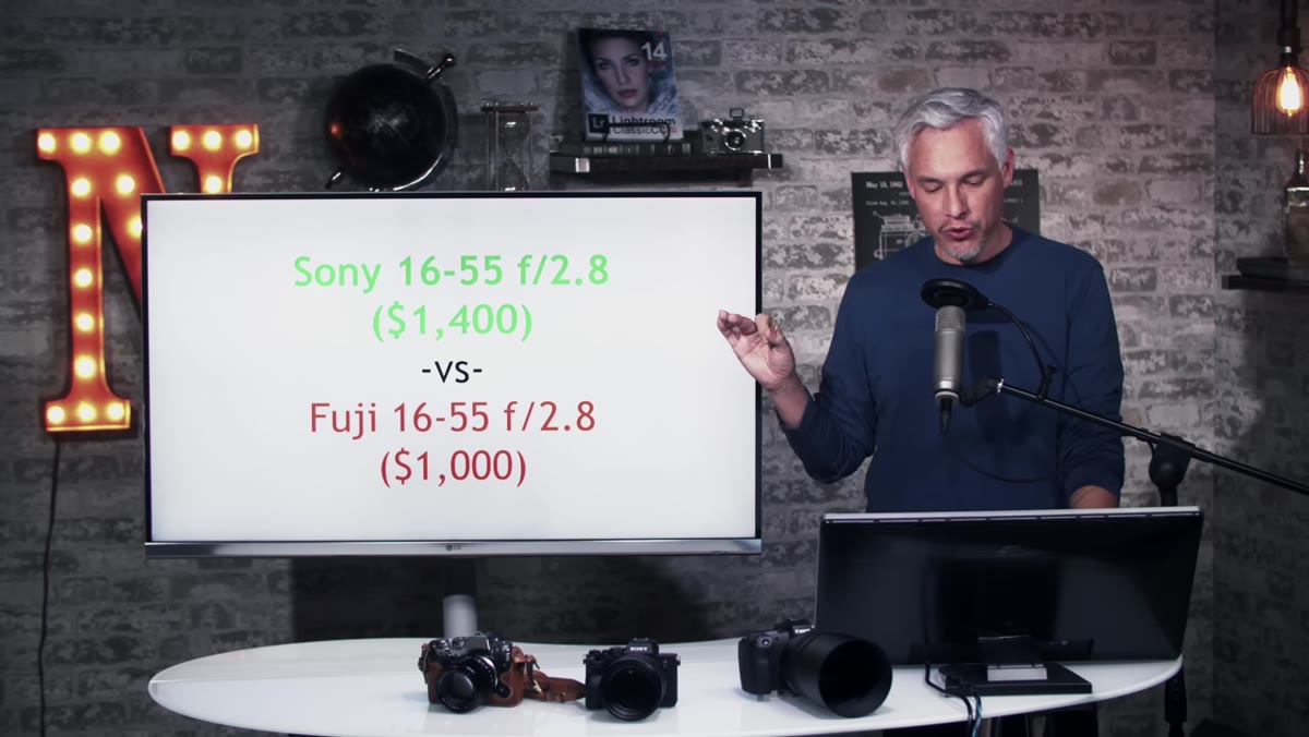 Sony 16-55mm f/2.8 and Fuji 16-55mm f/2.8 side by side
The first head-to-head is the Sony 16-55mm f/2.8 (around $1,400) against the Fuji 16-55mm f/2.8 (around $1,000). At 16mm in the center of the frame, both lenses are strong. You’re not going to look at these images and immediately know which one cost more. The real story only shows up when you push into the corners.
Sony 16-55mm f/2.8 and Fuji 16-55mm f/2.8 side by side
The first head-to-head is the Sony 16-55mm f/2.8 (around $1,400) against the Fuji 16-55mm f/2.8 (around $1,000). At 16mm in the center of the frame, both lenses are strong. You’re not going to look at these images and immediately know which one cost more. The real story only shows up when you push into the corners.
At 16mm in the corners, the Sony edges ahead. This tracks with the price difference, but it’s worth noting that “ahead” in this context means subtle. Zoom to 55mm and run the same comparison, and the Sony again shows a slight advantage in both center and corner sharpness. The Fuji picks up some processing artifacts in fine lines when handled through Lightroom, specifically because the X-T3 uses an X-Trans sensor layout rather than a standard Bayer filter. If you’re a Fuji shooter, this is something to account for in your raw processing workflow.
Step 3: Evaluate the Kit Lenses Honestly, Not Just on Paper
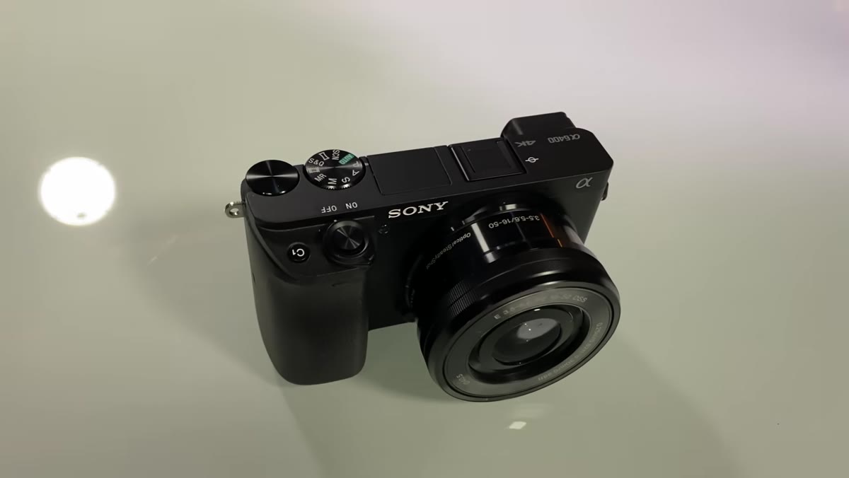 Kit lens comparison wide shot, no visible difference
Kit lens comparisons get dismissed too often. Tony takes them seriously here, and you should too, because most people buying into a system for the first time are going to spend months shooting with whatever comes in the box. The Sony kit lens is an f/3.5-5.6. The Fuji kit lens is an f/2.8-4.0. That one-stop advantage matters in real shooting conditions, not just in spec sheets.
Kit lens comparison wide shot, no visible difference
Kit lens comparisons get dismissed too often. Tony takes them seriously here, and you should too, because most people buying into a system for the first time are going to spend months shooting with whatever comes in the box. The Sony kit lens is an f/3.5-5.6. The Fuji kit lens is an f/2.8-4.0. That one-stop advantage matters in real shooting conditions, not just in spec sheets.
At the wide end, both lenses look nearly identical at a glance. At the long end and in the corners, the Sony kit lens actually holds its own better than you’d expect for the price. But here’s the honest take: the Fuji kit lens’s wider aperture means you’re gathering more light, getting shallower depth of field, and producing cleaner images in low-light without touching your ISO. On paper the Sony is marginally sharper at the same aperture. In practice, the Fuji is more versatile.
Step 4: Look at Portrait Lenses as a System-Level Decision
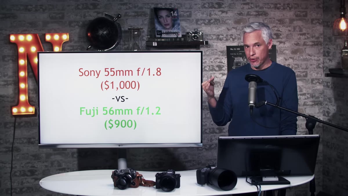 Sony 55mm f/1.8 and Fuji 56mm f/1.2 comparison
This is where the comparison gets more interesting, and more honest. The Fuji 56mm f/1.2 is a dedicated APS-C portrait lens built for that sensor format. The closest Sony equivalent Tony could match it to on price and focal length is the Sony 55mm f/1.8, but there’s a major caveat: that Sony lens is a full-frame lens being used on an APS-C body.
Sony 55mm f/1.8 and Fuji 56mm f/1.2 comparison
This is where the comparison gets more interesting, and more honest. The Fuji 56mm f/1.2 is a dedicated APS-C portrait lens built for that sensor format. The closest Sony equivalent Tony could match it to on price and focal length is the Sony 55mm f/1.8, but there’s a major caveat: that Sony lens is a full-frame lens being used on an APS-C body.
Sony does not make a dedicated APS-C portrait prime in this focal range. That’s not a small detail. It tells you something about how seriously each manufacturer is investing in their APS-C ecosystem. Fuji built a lens specifically for this sensor size and this use case. Sony adapted one from their full-frame lineup. Both produce quality results, but if portrait work is central to why you’re buying a camera, Fuji’s native lens investment is a real differentiator.
Step 5: Factor in the X-Trans Processing Quirk Before You Decide
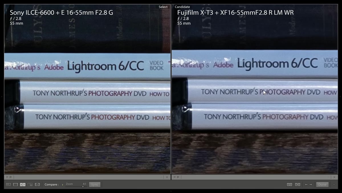 Lightroom processing artifacts visible in fine lines
This one often gets buried in lens reviews, but it’s operationally important. The X-Trans sensor in Fuji cameras handles color and detail differently from a Bayer-pattern sensor, and not every raw processor handles it equally well. In Tony’s test, Lightroom’s standard processing introduced visible artifacts in fine lines and colored edges on the Fuji files. He used the Enhanced Details option, which helps, but it adds processing time and is not a perfect fix.
Lightroom processing artifacts visible in fine lines
This one often gets buried in lens reviews, but it’s operationally important. The X-Trans sensor in Fuji cameras handles color and detail differently from a Bayer-pattern sensor, and not every raw processor handles it equally well. In Tony’s test, Lightroom’s standard processing introduced visible artifacts in fine lines and colored edges on the Fuji files. He used the Enhanced Details option, which helps, but it adds processing time and is not a perfect fix.
If you shoot Fuji and process in Lightroom, test your workflow with the specific types of detail your work involves. Fine fabric textures, text, and repetitive patterns are where you’re most likely to see this. Capture One handles X-Trans files considerably better for most users, though it comes with its own learning curve and cost.
My Take: Sharpness Is a Tiebreaker, Not a Deal-Breaker
I’ve personally run blind comparisons at photography meetups where people couldn’t reliably tell which image came from the cheaper or the pricier system. Sharpness matters, but it rarely matters as much as we think it does when we’re deep in pixel-peeping territory. What I took from this comparison is that both Sony and Fuji APS-C glass is genuinely good, and neither system is going to embarrass you.
What the comparison actually surfaces is a philosophy difference. Fuji is investing deeply in APS-C glass, building lenses designed from the ground up for that sensor size. Sony’s APS-C ecosystem benefits from being adjacent to their full-frame lineup, which means you get excellent glass, but it’s not always glass built with APS-C shooters as the primary audience. If you’re planning to stay APS-C long-term, that distinction is worth taking seriously before you commit to a mount. If you’re treating APS-C as a stepping stone to full-frame, Sony’s ecosystem continuity is a genuine advantage.
The single most useful thing this video does is remind you to evaluate the whole system, not just the body you’re holding in the store. Research the lenses you’ll actually buy in the next two to three years, compare their prices and apertures, and decide based on that roadmap. The body is rented. The mount is the commitment.
Watch the full tutorial on YouTube to see Tony’s actual side-by-side image comparisons in 4K, which make the sharpness differences far easier to evaluate than any description can.
Comments
Leave a Comment