Every time I’m about to buy a lens, I open a spreadsheet. I know how that sounds. But when you’ve tested as many budget lenses as I have, you stop trusting marketing copy and start trusting data. The problem is that most lens comparisons focus on sharpness charts and bokeh rendering, and they skip the one thing that actually changes how your photos feel - how focal length reshapes the relationship between your subject and the background.
That’s exactly what Pierre T. Lambert tackles head-on in this tutorial. Watch the full tutorial on YouTube - he shoots a model named Trina against a coastal backdrop with buildings in the distance, keeping her at one-third of the frame in every single shot, then cycles through 16mm, 24mm, 35mm, 50mm, 70mm, 105mm, and 200mm. Same subject, same framing, totally different images. The result is one of the clearest visual demonstrations of compression and distortion I’ve seen, and it’s the kind of thing that should change how you decide which lens to reach for.
I’ve seen this concept explained in textbooks and forum posts a hundred times. Watching it play out on actual images of an actual person in an actual landscape is different. Here’s the full breakdown.
Step 1: Set a Consistent Framing Rule Before You Touch a Focal Length
 Trina standing as subject, framing briefed before shooting
Before Pierre fires a single shot, he locks in a constraint. The subject occupies the middle third of the frame in every image. That rule is what makes the comparison valid. If you let the framing drift as you change lenses, you’re no longer comparing focal lengths - you’re comparing compositions.
Trina standing as subject, framing briefed before shooting
Before Pierre fires a single shot, he locks in a constraint. The subject occupies the middle third of the frame in every image. That rule is what makes the comparison valid. If you let the framing drift as you change lenses, you’re no longer comparing focal lengths - you’re comparing compositions.
If you want to run this test yourself, pick a fixed subject, mark where they’re standing, and decide exactly how much of the frame they’ll fill. Then commit to that and don’t adjust it. The interesting differences only show up when everything else stays the same.
Step 2: Start Wide - 16mm and 24mm
 Wide angle shot at 16mm, subject small with expansive background
At 16mm and 24mm, Pierre has to get close to his subject to fill that one-third of the frame. The immediate result is that the background - buildings, water, horizon - looks small and far away. The scene feels open, almost airy. That’s not a quality judgment, it’s a tool. Wide angles push backgrounds back and make environments feel expansive.
Wide angle shot at 16mm, subject small with expansive background
At 16mm and 24mm, Pierre has to get close to his subject to fill that one-third of the frame. The immediate result is that the background - buildings, water, horizon - looks small and far away. The scene feels open, almost airy. That’s not a quality judgment, it’s a tool. Wide angles push backgrounds back and make environments feel expansive.
The trade-off at this range is distortion on anything close to the edges of the frame, including people. At 16mm especially, if your subject is near the edge, their proportions are going to look stretched. Keep people centered when shooting this wide, or be ready to use that distortion as a deliberate stylistic choice.
Step 3: Move Into the Middle Range - 35mm and 50mm
 Mid-range focal length comparison, subject fills frame naturally
At 35mm and 50mm, Pierre steps back to maintain the same subject size in frame. This is where things start to feel more “normal” to the eye. The background grows. The distance between subject and environment starts to compress, even if only slightly. The scene reads as more balanced.
Mid-range focal length comparison, subject fills frame naturally
At 35mm and 50mm, Pierre steps back to maintain the same subject size in frame. This is where things start to feel more “normal” to the eye. The background grows. The distance between subject and environment starts to compress, even if only slightly. The scene reads as more balanced.
The 50mm in particular is worth studying in this comparison. It tends to match roughly what the eye sees in terms of spatial relationships, which is why it gets called a “nifty fifty” for general use. But it’s not magic - it just doesn’t lie to you the way a wide or telephoto does.
Step 4: Push to 70mm and 105mm - Watch the Background Stack
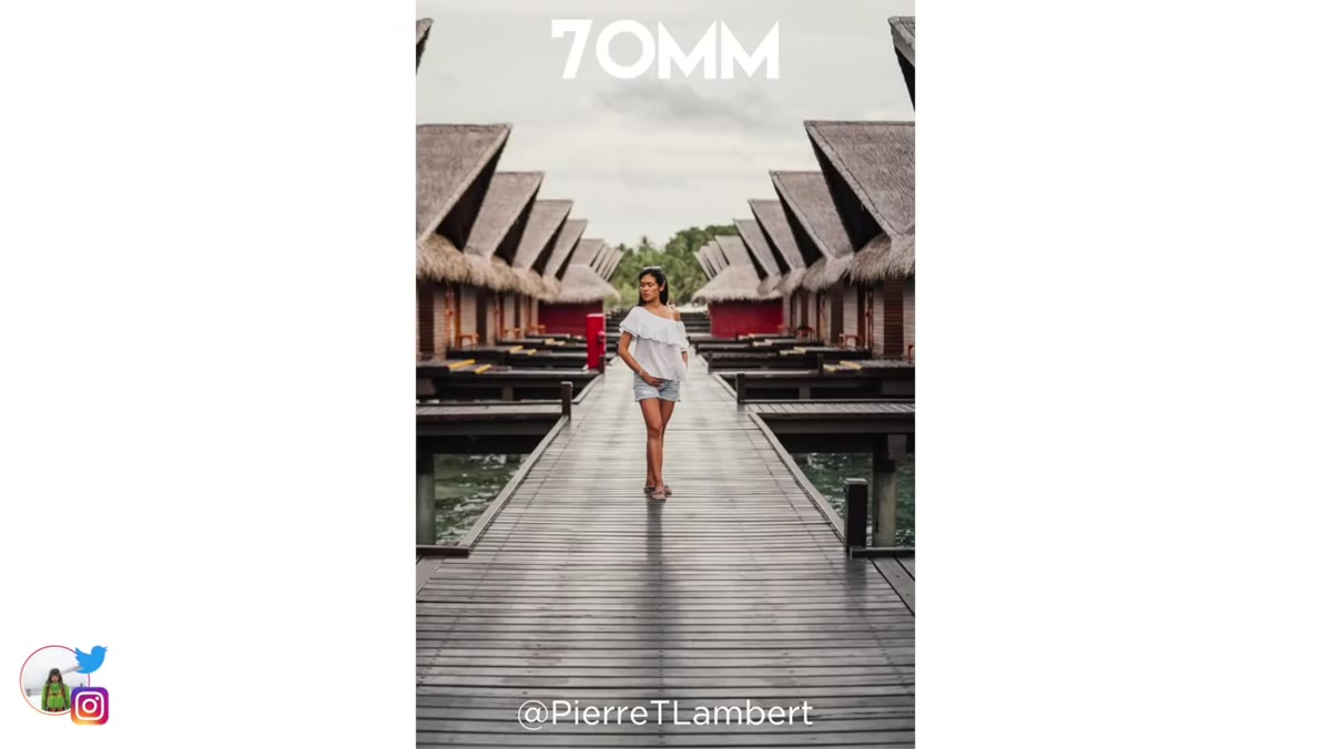
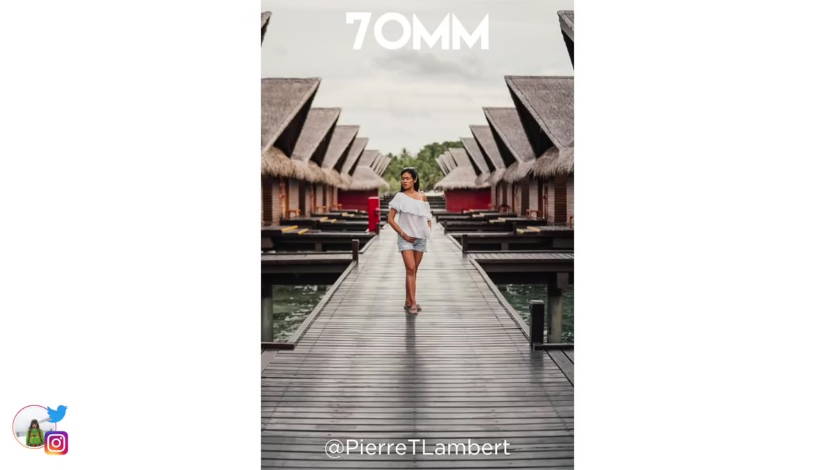 Buildings appear larger and closer behind subject at longer focal length
This is where the tutorial gets genuinely instructive. As Pierre moves to 70mm and 105mm, he’s now standing much further from his subject - but Trina still fills the same third of the frame. The background has expanded dramatically. Those distant buildings look closer, larger, and stacked tighter behind her.
Buildings appear larger and closer behind subject at longer focal length
This is where the tutorial gets genuinely instructive. As Pierre moves to 70mm and 105mm, he’s now standing much further from his subject - but Trina still fills the same third of the frame. The background has expanded dramatically. Those distant buildings look closer, larger, and stacked tighter behind her.
This is background compression, and it’s one of the most useful tools in photography. At 105mm, the scene stops feeling like a wide environment with a person in it and starts feeling like a person who exists within a scene that’s pressing in around her. That’s a meaningfully different emotional register, and it comes entirely from focal length.
Step 5: Go to 200mm - Full Compression Effect
 Maximum compression at 200mm, background elements appear closest to subject
At 200mm, Pierre is shooting from far enough away that the compression effect is at its peak. The background buildings look almost as tall as the subject. Everything feels dense, layered, close. If you’ve ever looked at a photo of a runner in a city street where the skyscrapers look like they’re right on top of them - that’s this. That shot was taken with a long lens from a long distance.
Maximum compression at 200mm, background elements appear closest to subject
At 200mm, Pierre is shooting from far enough away that the compression effect is at its peak. The background buildings look almost as tall as the subject. Everything feels dense, layered, close. If you’ve ever looked at a photo of a runner in a city street where the skyscrapers look like they’re right on top of them - that’s this. That shot was taken with a long lens from a long distance.
The practical application Pierre calls out is street photography in dense urban environments. A long lens from across the street will make the architecture feel like it’s wrapping around your subject. A wide lens from up close will make those same buildings look like they’re far away set dressing. Both are valid. They’re just completely different photos.
Step 6: Convert the Series Into a GIF or Animation
 Animated GIF blend between focal lengths previewed on screen
Pierre mentions blending the series into an animated GIF to make the transition between focal lengths visible in motion. It’s a technique he borrowed from portrait photographers who use it to show facial distortion across focal lengths.
Animated GIF blend between focal lengths previewed on screen
Pierre mentions blending the series into an animated GIF to make the transition between focal lengths visible in motion. It’s a technique he borrowed from portrait photographers who use it to show facial distortion across focal lengths.
If you want to try this yourself, shoot your series in one session with locked exposure settings, then drop the images into Photoshop, GIMP, or even a free tool like EZGif. Set a short frame delay - around 0.5 to 1 second - and let it loop. Seeing the background expand and contract as the focal length changes in motion makes the compression effect obvious in a way that a static comparison sometimes doesn’t.
What This Actually Means for Budget Lens Buying
This tutorial reinforced something I come back to constantly: the lens you’re missing from your kit is usually determined by the effect you can’t create, not the sharpness you can’t achieve.
If every photo you take looks like the environment around your subject is far away and small, you probably need a longer lens. If everything feels cramped and there’s no sense of space, go wider. I’ve seen photographers spend $400 upgrading to a sharper version of the same focal length they already own when a $150 used 85mm or a $99 manual 135mm would have completely changed what their photos looked like. The effect Pierre demonstrates here is real, it’s dramatic, and it’s accessible at any price point. A vintage 135mm f/2.8 from a thrift store or a used 70-200mm zoom on the low end of the market will get you the compression you see at the long end of this comparison. The focal length does the work.
The single most important thing this tutorial demonstrates is that focal length changes reality, not just magnification. Longer lenses make backgrounds feel closer and more present. Wider lenses push them back and open up space. Knowing which effect you want before you pick up a camera is the difference between a photo that works and one that almost works.
Watch the full tutorial on YouTube to see all seven focal lengths side by side - the animated comparison alone is worth the few minutes.
Comments (2)
I've watched a dozen tutorials on this and yours is the clearest by far.
Finally someone explains this in a way that actually makes sense.
Leave a Comment